Rankings for the Project VOLTAGE designs (Hatsune Miku x Pokémon)
Over 100 people voted on each design. Which one was the most popular?
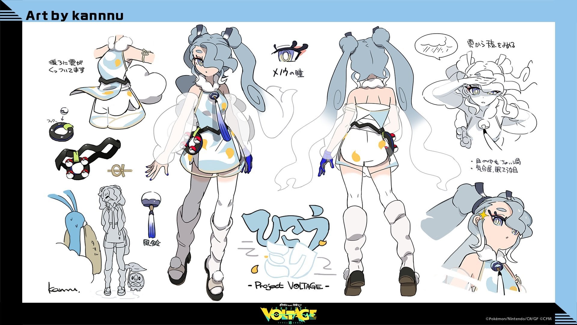
Rank 9: Water (Average: 3.64)
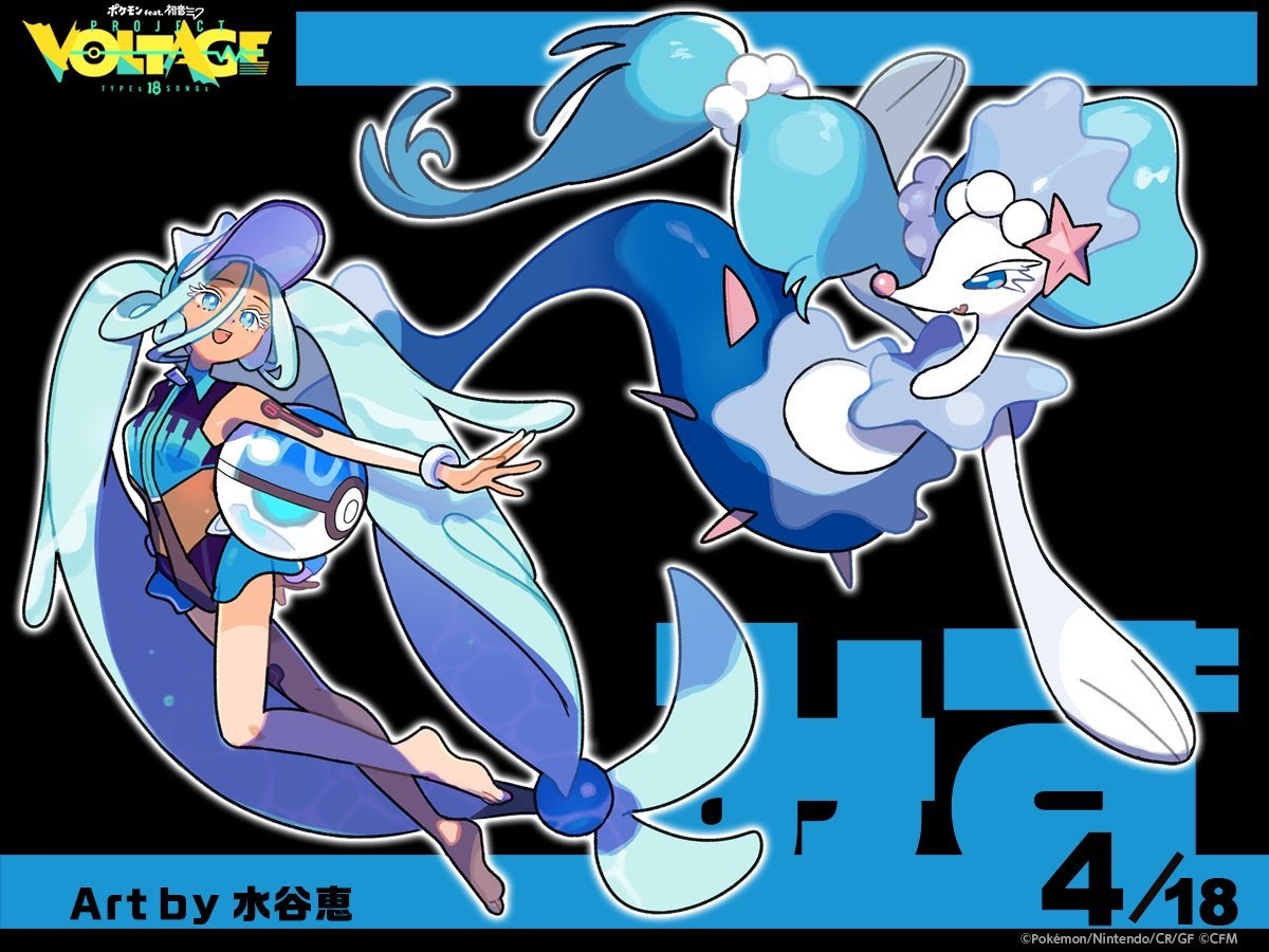
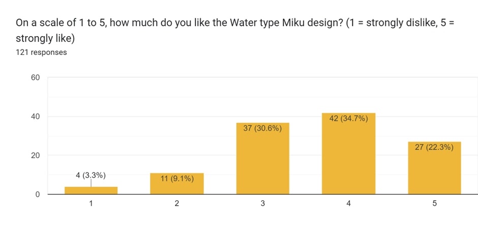
The Water-type design, also by Megumi Mizutani, was the fourth revealed in the collaboration. It has a very similar distribution to the Bug-type design, with two less 5 scores, but also less 2 scores that helped bring the average up just enough.
It was a fitting design for a Water Trainer, although maybe too predictable for one voter:
Water Miku looks *good*, and would probably be higher on score if I wasn’t bored of the whole Water type = Person on swimsuit thing.
Water and Fairy: Great design, it feels like Hatsune Miku, the Pokémon partner pairs well with the design itself and the theme of songs and music.
Fairy won’t appear just yet – so who was next?
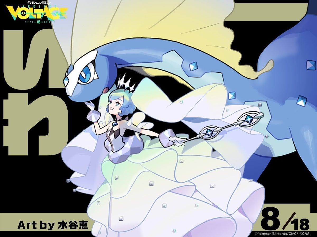
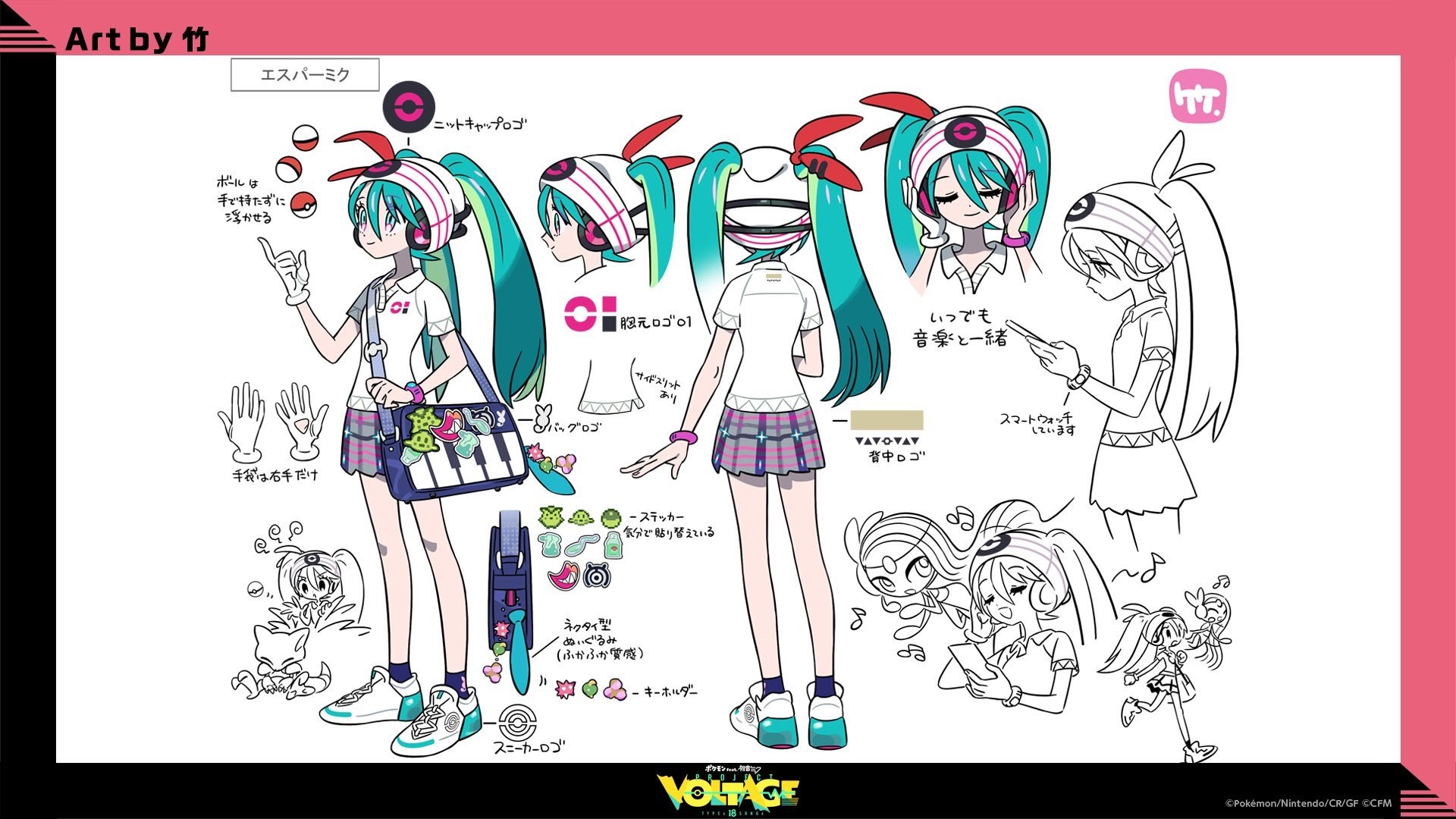
Rank 8: Psychic (Average: 3.69)
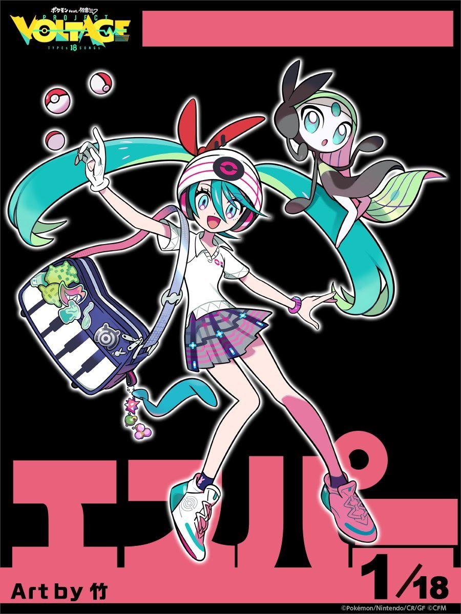
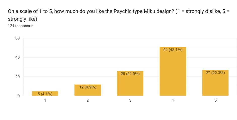
The Psychic-type design was done by take, the first of three we see enter the rankings. Scores of 4 were the norm for this design – in fact, it got the most 4 scores of any design. It was also the first one revealed – a solid start to the collaboration.
Meloetta is a good choice of Pokémon for Miku, one feels, and this is reflected in comments:
I really like Psych[ic]-Type Miku. Both the Pokémon (Meloetta) and her Design are very well chosen. You can still really well see that Miku is Miku, while the Pokémon complements her perfectly with both of them being singers/divas so to say.
My overall favorite is Psychic (Miku and Meloetta) as I feel like its a design that The Pokémon Company would use if Miku were added to the games. It also works thematicly due to meloetta being associated with miku long before the collab, and meloetta (anime) sharing a voice provider with Megpoid GUMI. Granted, without the floating pokeballs, the overall design doesnt match for any particular type, but I also feel that there is a specific reason they chose to begin with psychic rather than grass, fire, water, electric or normal
A neat observation there in regards to starting with Psychic! Next place was only 0.2 higher on average:
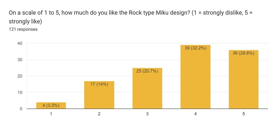
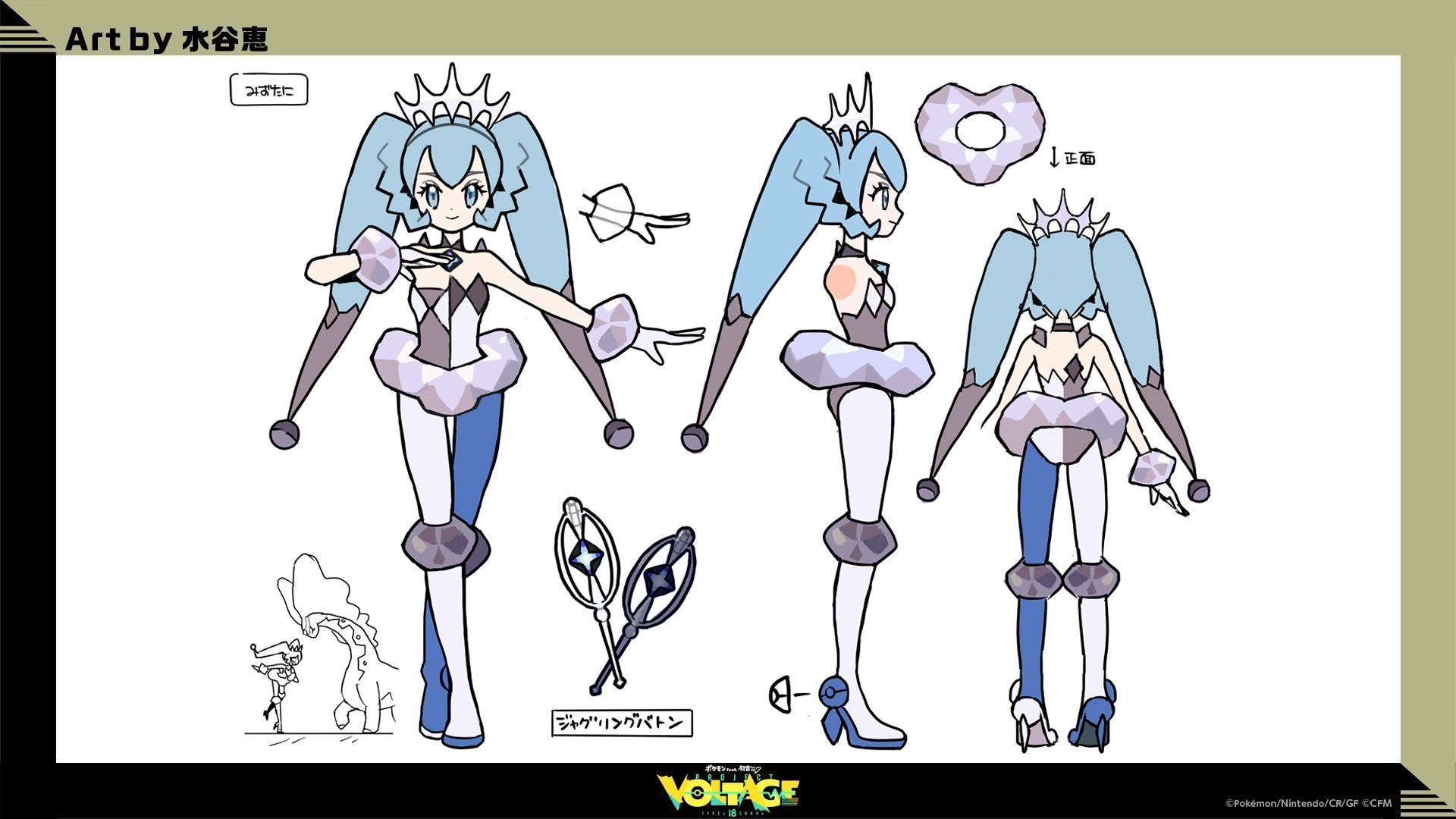
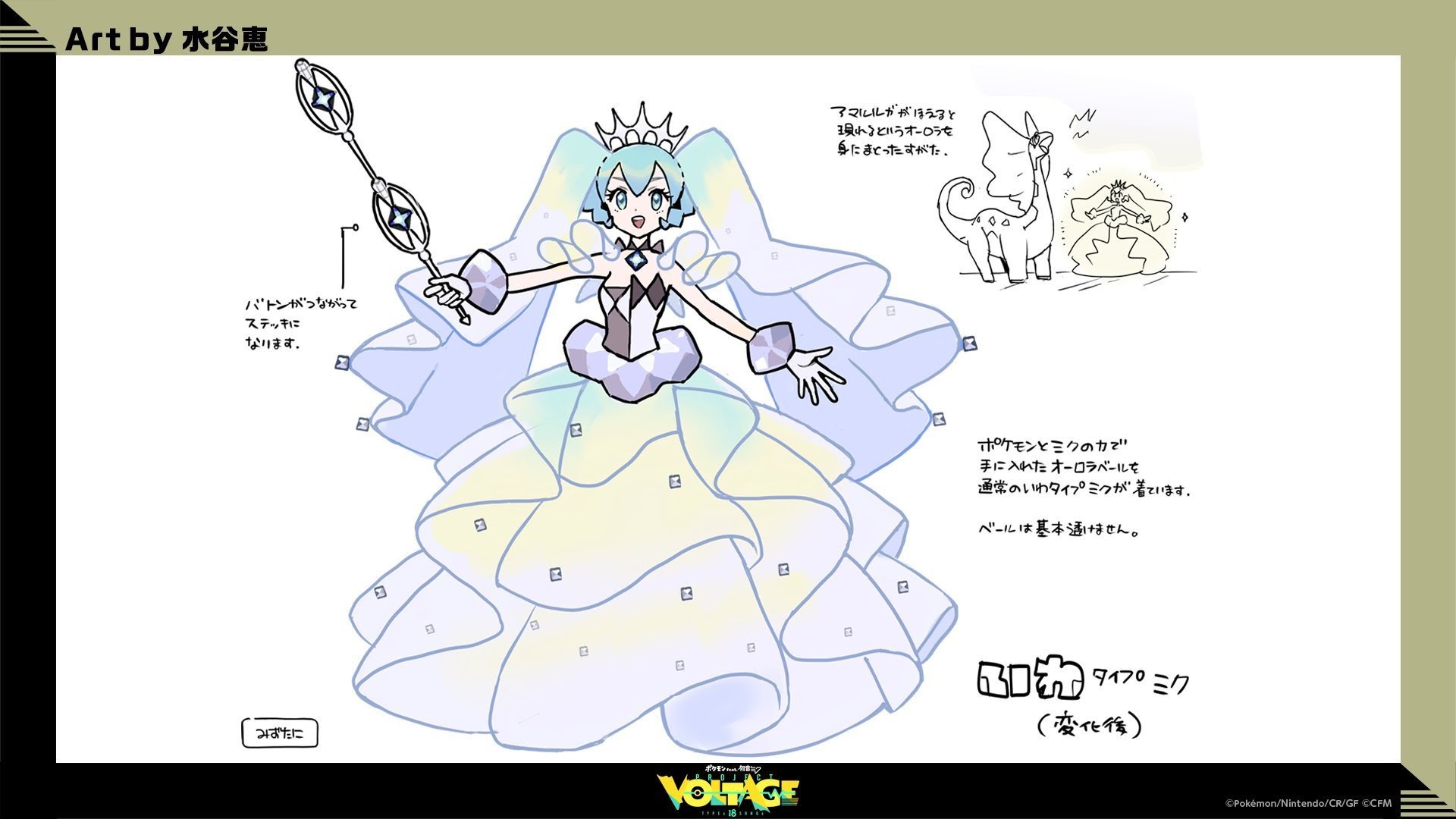
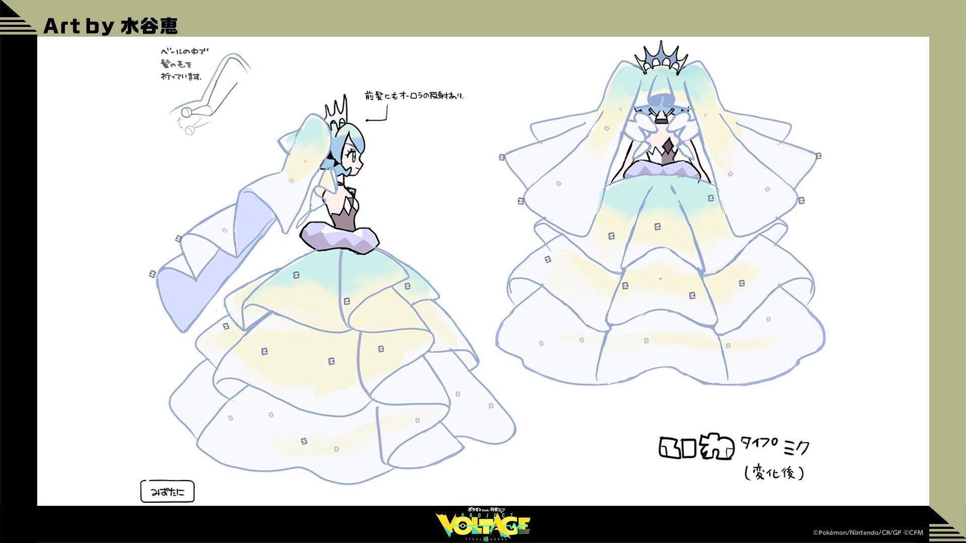
Rank 7: Rock (Average: 3.71)
 Concept art (2 3)
The Rock-type design was also done by Megumi Mizutani. Scores of 4 again topped out here.
The style was a bit different to others, and also what one might initially think of rock (Rock music, anyone?). This was reflected in some comments:
Contrastingly, Rock doesn’t exactly strike me as “Yea that’s a rock type trainer”, I see more ice or fairy
Rock: Love the design, but the artist based the design too much into Aurorus, to the point it feels more like an ice type trainer than a rock one (without the skirt it does feel more rock like).
But it proved popular amongst the voters.
My favorite is the Rock type because it’s so elegant like a diamond princess.
I like Rock because Aurorus is cool
One wonders if the last comment had an intentional pun…
There was a bit of a gap in scores between 7th and 6th.
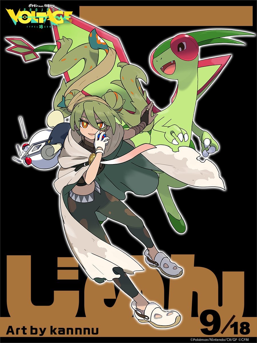
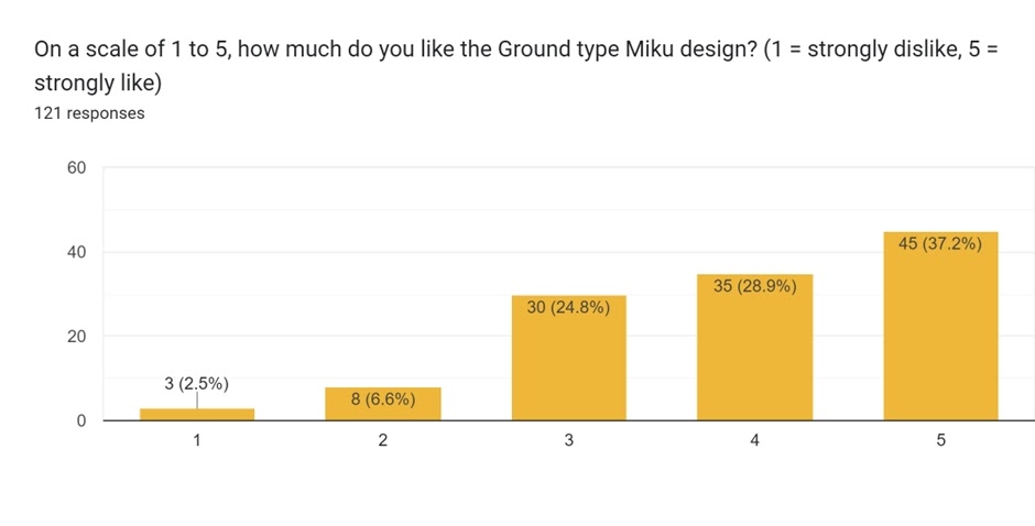
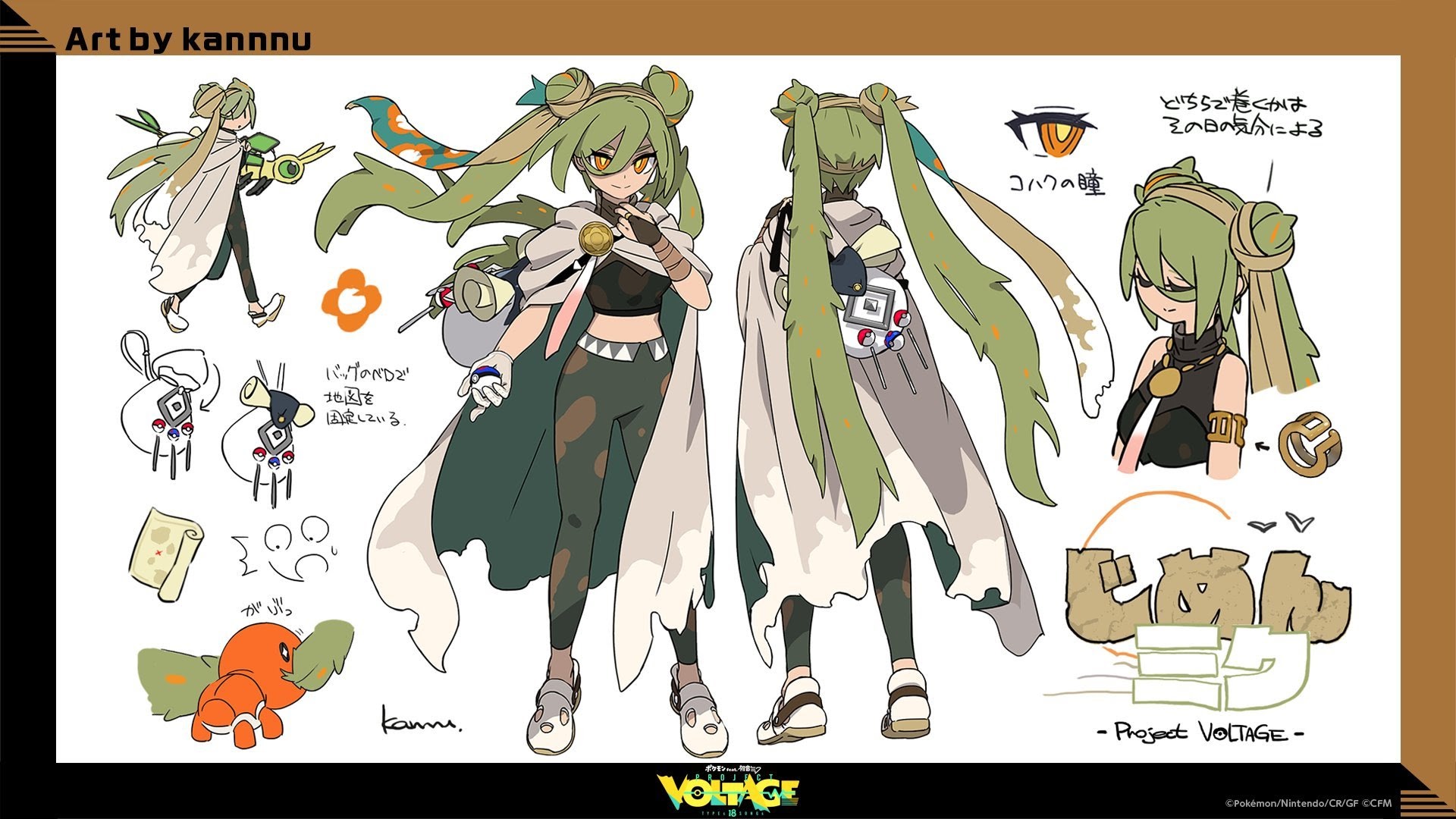
Rank 6: Ground (Average: 3.92)
 Concept art (2)
The Ground-type design was done by kannnu, the first of two designs by them we’ve seen here. This is the first time a score of 5 was the most popular vote, and the fourth-highest count of 5s. But compared to the next two, there were a few more lower scores that brought down the average. Ah, statistics.
This one was quite popular score-wise – probably helped by the use of a fan favourite in Flygon. But there hadn’t been many comments on it beyond short ‘it is cool’ or the like. Here is one that elaborated a bit:
And Ground looks very adventurous and badass instead of girly. Plus midriff. Everybody loves midriffs.
I mean… yeah.
The top five awaits us! Who beat out Ground?
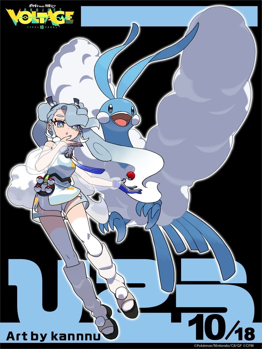
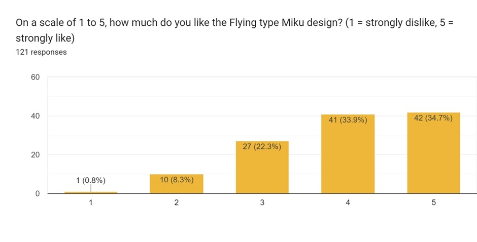
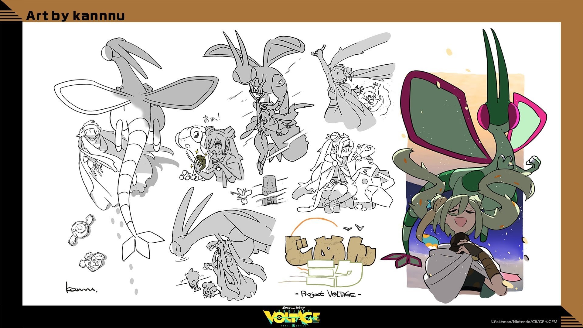
Rank 5: Flying (Average: 3.93)
 Concept art (2)
The Flying-type design was also done by kannnu. This design had only just beat out Ground on the average score, with more 4 scores helping bring the mean up. Clearly kannnu’s designs were popular! Only one person gave it a score of 1, the equal-lowest count there. (That does mean no design was without a 1 score. No participant gave flat scores of 1 to most designs, either.)
There hadn’t been many comments on the Flying type design. Here is one that summed it up decently:
Metal and Flying are adorable but in a less squishy way compared to Bug and Fairy.
Who came in 4th?
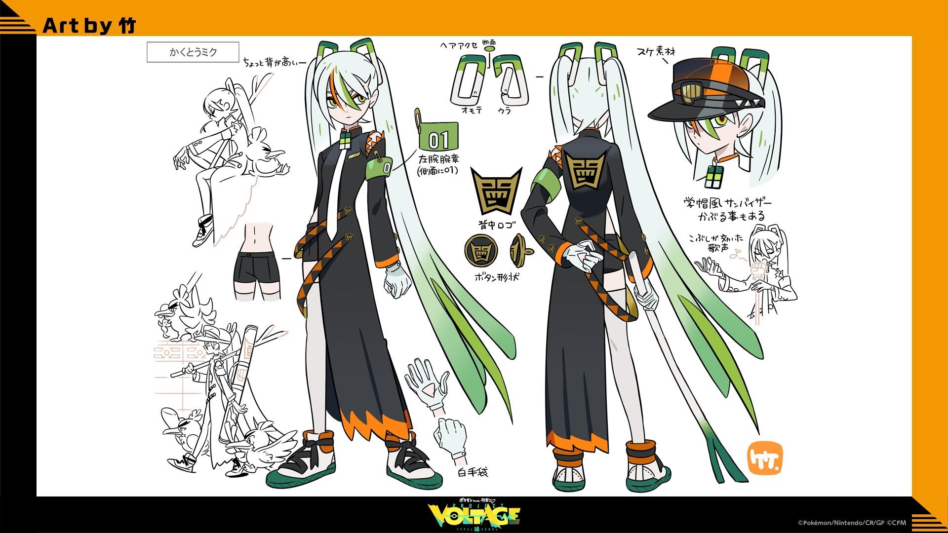
Rank 4: Fighting (Average: 3.99)
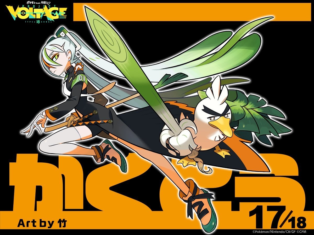
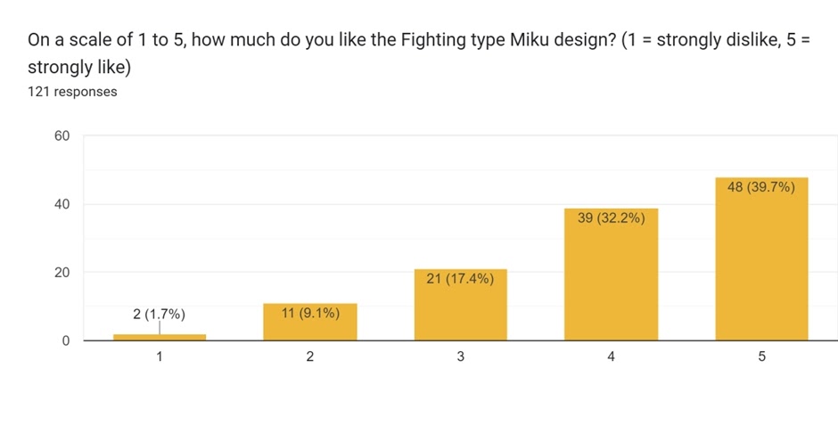
The Fighting-type design was also done by take. 4 and 5s really dominated, with the average score falling just short of 4. And is it any surprise that one of these designs involved the Leek Duck Pokémon?
One commentator gave great praise to this design in their analysis:
Last but certainly not least: Fighting-Type Miku. I really like how Design of Miku both keeps her original style while adapting her color scheme to fit her Pokémon Partner. Both makes Miku still recognizable, while still giving a sense of those two being partners. As both have Leek “Swords”(?) that gives another overlap. Additionally, the motion the illustration tries to convey makes it feel energetic in my opinion.
Now we have the top three, each with an average score above 4.
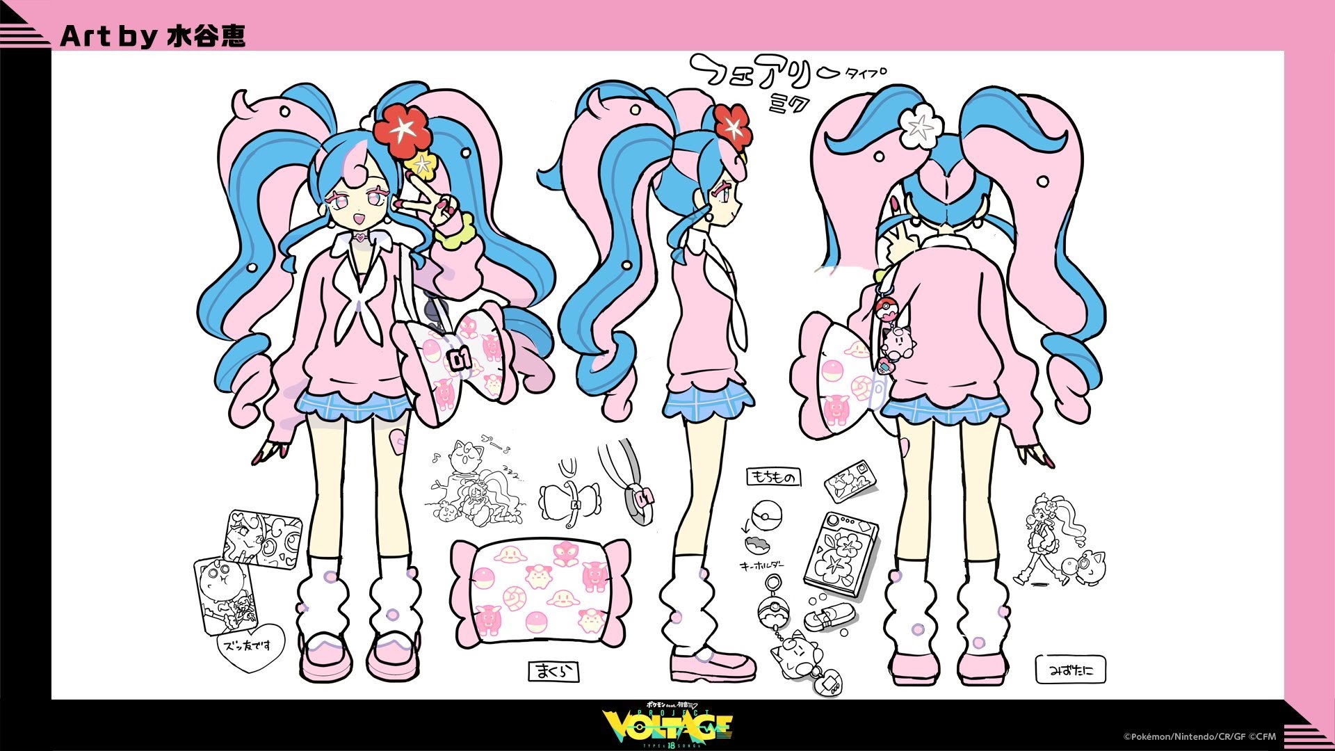
Rank 3: Fairy (Average: 4.03)
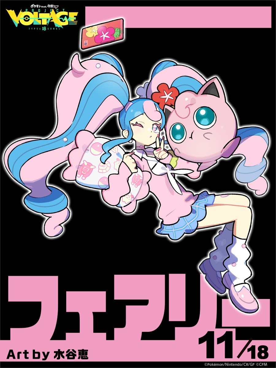
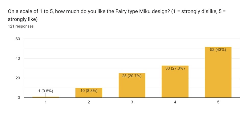
The Fairy-type design was also done by Megumi Mizutani, the last of their eight designs. Along with Flying, it only received one score of 1, while it received the third highest number of 5 scores. Makes sense it landed in third place!
One commentator wasn’t a fan of the perhaps expected pink theme:
But some fans do like pink:
fairy type Miku looks the best because the colors and design is wonderful.
Fairy fits so well. Love the ones that play with her hair a lot.
There was a bit of a gap again between Fairy and the top two, however, in terms of score.
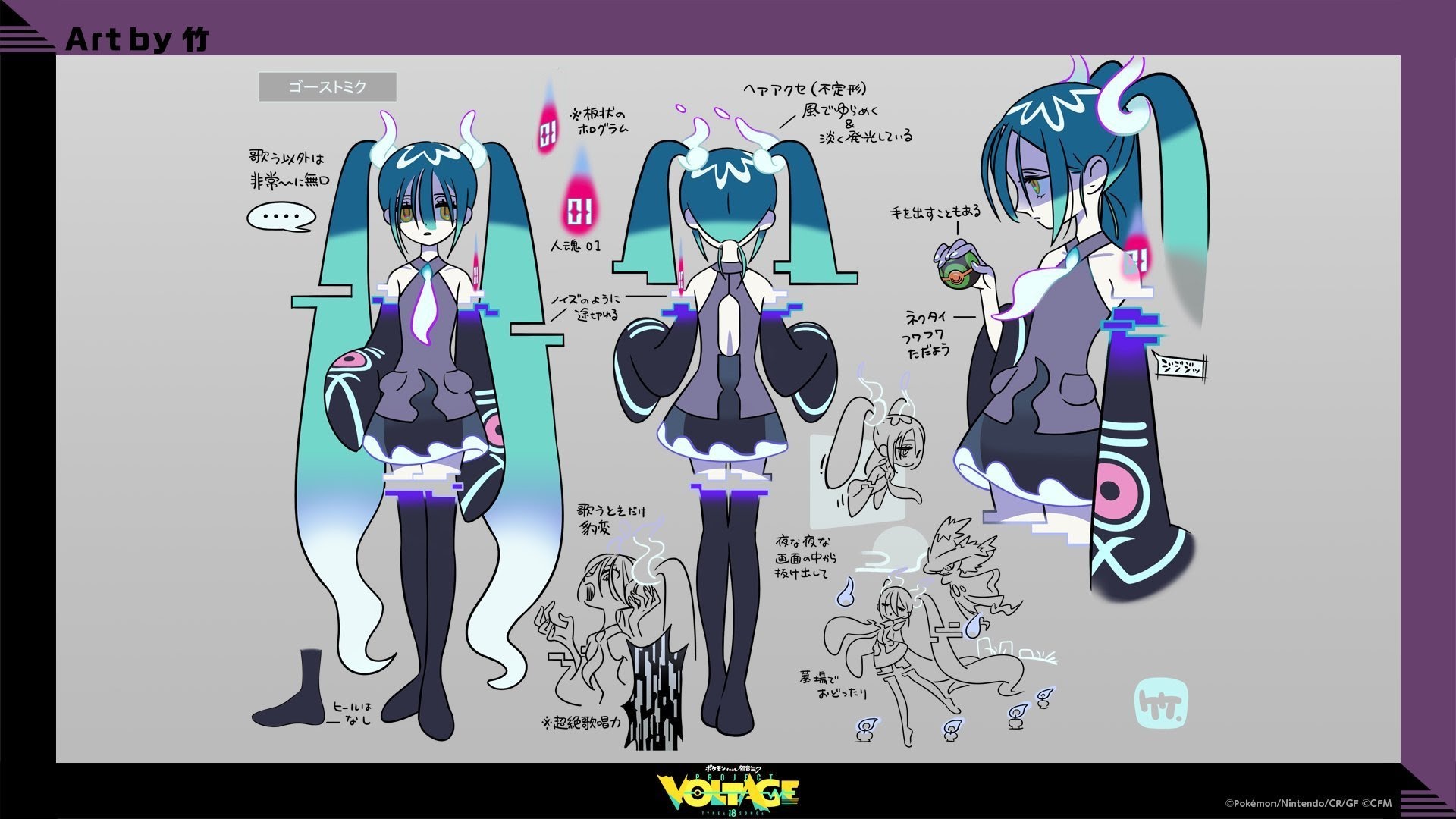
Rank 2: Ghost (Average: 4.29)
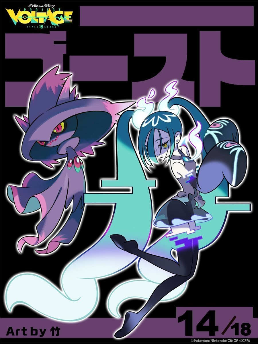
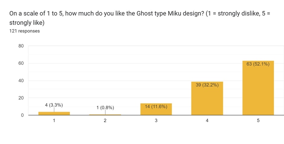
The Ghost-type design was also done by take – their final design. It was really sparse at the bottom, with only one score of 2, the lowest by far! And only four scores of 1 is a good feat too. Over 80% of the scores were 4 or 5, showing how popular this design was.
Perhaps one point of contention was the glitchy effect seen:
For Ghost type Miku I really like the Design, especially the glitch like effect. The Pokemon also tries to copy her pose, making them feel in sync with each other. Not much else to say here.
The ghost glitchiness is a cool detail.
Ghost Miku is cute in a gloomy way!
My least favorite was Ghost Miku. I think the concept for it was interesting (glitched/deleted program), and I do like how her hair/hairbands were styled, but it feels very underdone and even a bit ridiculous (how does she even achieve that glitch effect, hologram technology? Even for Pokemon’s fantasy/anime standards it’s weird). I’m baffled at how many people liked that one. It’s definitely the most Miku-looking design compared to how she usually looks, and I guess that’s a reason to like it, but for me half the fun of these designs to do something different and embody each type while doing so. Ghost Miku, in my opinion, doesn’t do either of those things well.
And then we had more to-the-point summaries of opinions, such as:
Ghost one is awesome. 😀
Unfortunately for Ghost, it was just beaten out for first place. Here it is:
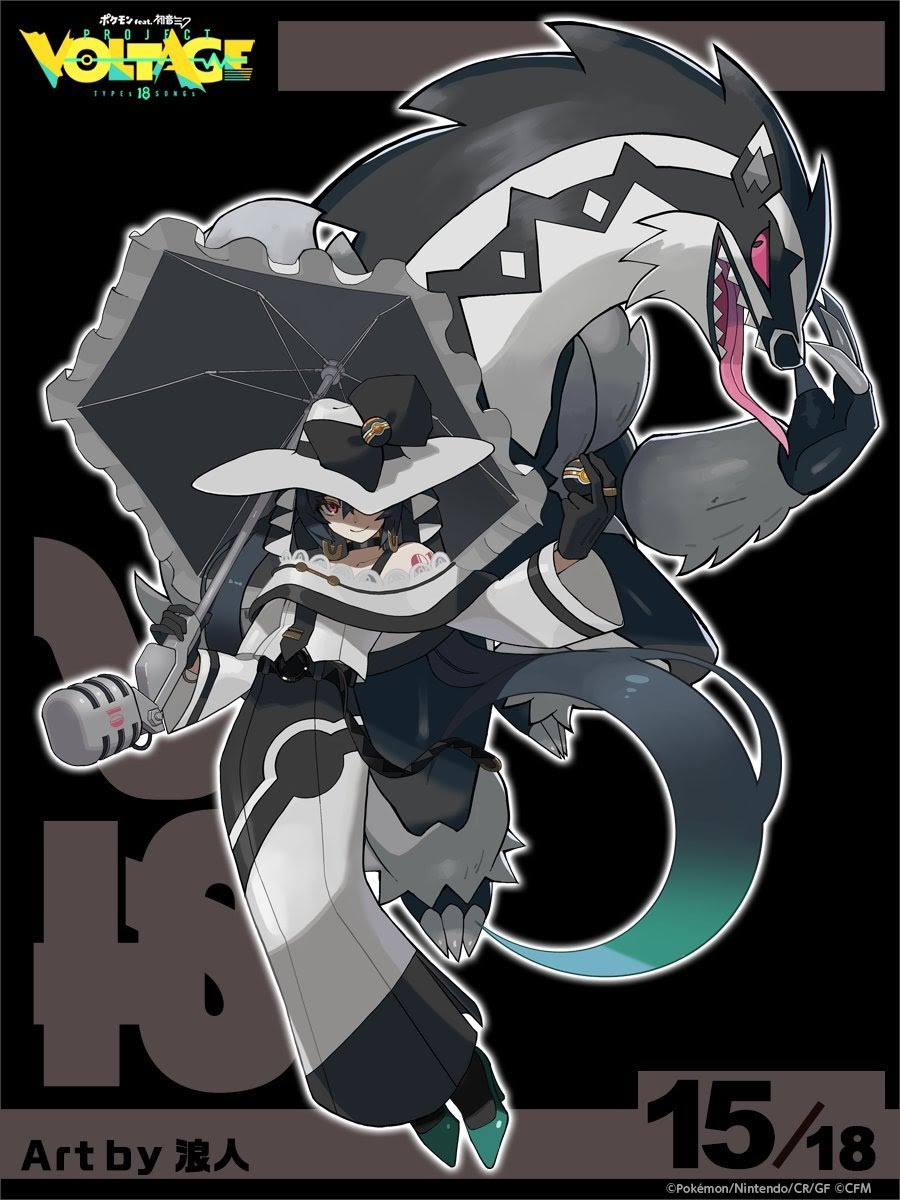
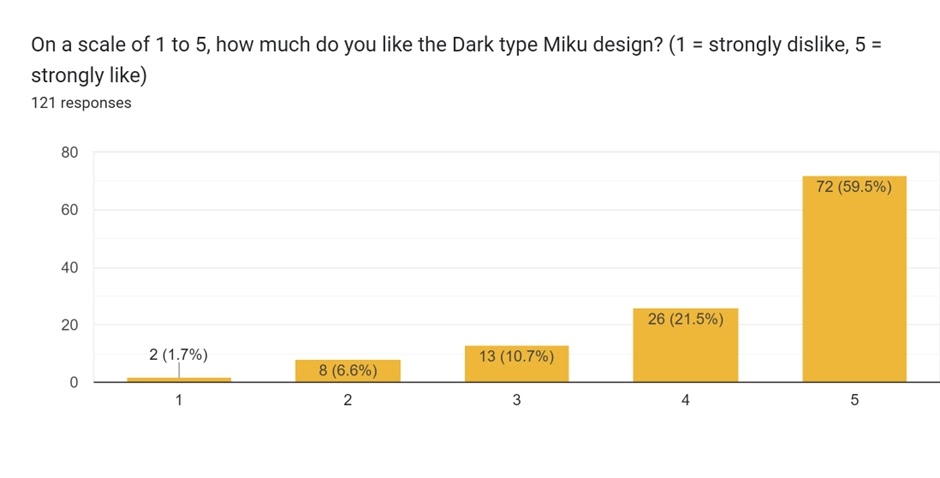
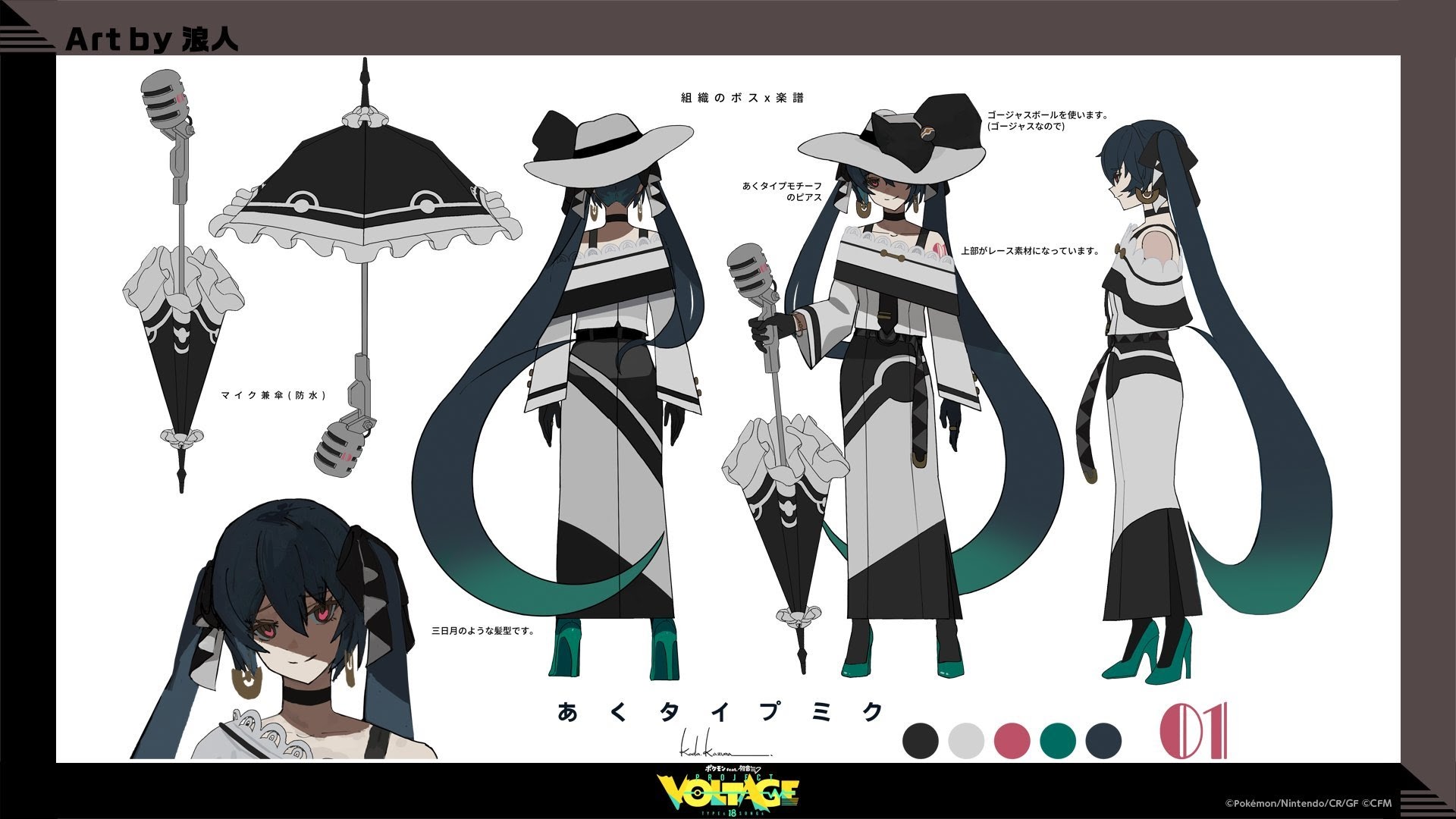
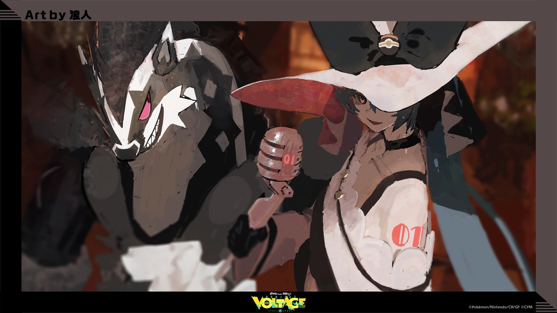
Rank 1: Dark (Average: 4.31)
The Dark-type design was done by Kazuma Koda, also known as Lownine – known for their work on NieR. Look at those 5 scores! Over half of the responses gave it a 5. It was this weight of high scores that helped it into first place. It had more 2 scores than Ghost’s design, and in fact would have been equal had one person’s score been 2 lower (e.g. a 5 turned into a 3). Talk about tight!
Had it been a draw, it might have been fair to give it to Dark by using the number of 5 scores as a tiebreaker.
Certainly the synergy between Miku and Obstagoon, and the difference in tone over most other designs, set it apart. This design also got the most comments! Here are some of them:
Dark Type Miku is Goth and that’s all I need.
Dark Miku is hot!
Dark and Ghost Miku are top tier designs that also stand out because they don’t fit the usual designs Miku is seen with!
Dark Miku is so cool. Really like the vibe that it has
Dark type is my favorite because she stand out from others in terms of personality and aesthetic. Her overall appearance just scream “wicked!” and I love it.
Dark type Miku is easily the best one. I feel it captures the vibe of said type pretty well, not to mention the Pokémon choice is on point. The mic parasoul is also an amazing touch.
Not everyone was a fan of the different direction:
I don’t think any of the designs look bad on their own, but a lot don’t look like miku. Dark type especially.
And the commentator who give an in-depth reasoning against Ghost quite liked the Dark-type design:
My favorite was Dark Miku. The colors, the theming, everything looks amazing. You can tell right away it’s Miku, but she also fits perfectly in the Pokemon world. The umbrella doubling as a microphone is also a neat way to keep her as a singer (even if it’s comically oversized) and giving her Luxury Balls to fit her rich, elegant style is genius. The artist even found a way to incorporate Miku’s tie in the dress and to keep her signature teal color in her hair tips and her heels without making it stand out too much against the white and black in her hat and dress. Even just the way her eyes are designed and her snooty expression help bring out the typing she represents. It also serves as a nice contrast to her Pokemon, Obstagoon, and it’s more classically menacing look while still keeping the color coordination.
There we have it – a very tight finish, but Dark came out as the most popular, with Ghost not far behind, and the pink Fairy design coming in third. How did your opinion compare to the average?
Edited by Sheep and Zach.