Rankings for the Project VOLTAGE designs (Hatsune Miku x Pokémon)
Over 100 people voted on each design. Which one was the most popular?
Project Voltage was an unexpected collaboration between Pokémon and virtual Vocaloid singer Hatsune Miku earlier this year. Part of the collab includes new songs – but another aspect was a series of artworks, featuring Miku as a type-themed Pokémon Trainer. That’s 18 designs in total, one for each type, with a different artist commissioned in each case. But which one was the most popular?
We conducted a poll via Google Forms to figure that out. 121 responses later, we have the results!
For each design, participants were shown the artwork and asked how they rated it on a scale of 5, 1 being ‘strongly dislike’, and 5 being ‘strongly like’. The average of those scores were then calculated for the overall ranking. Let’s start with the least popular, and see what type design came out on top at the end. We’ll summarise the scores for each case, and also offer some comments people shared as well.
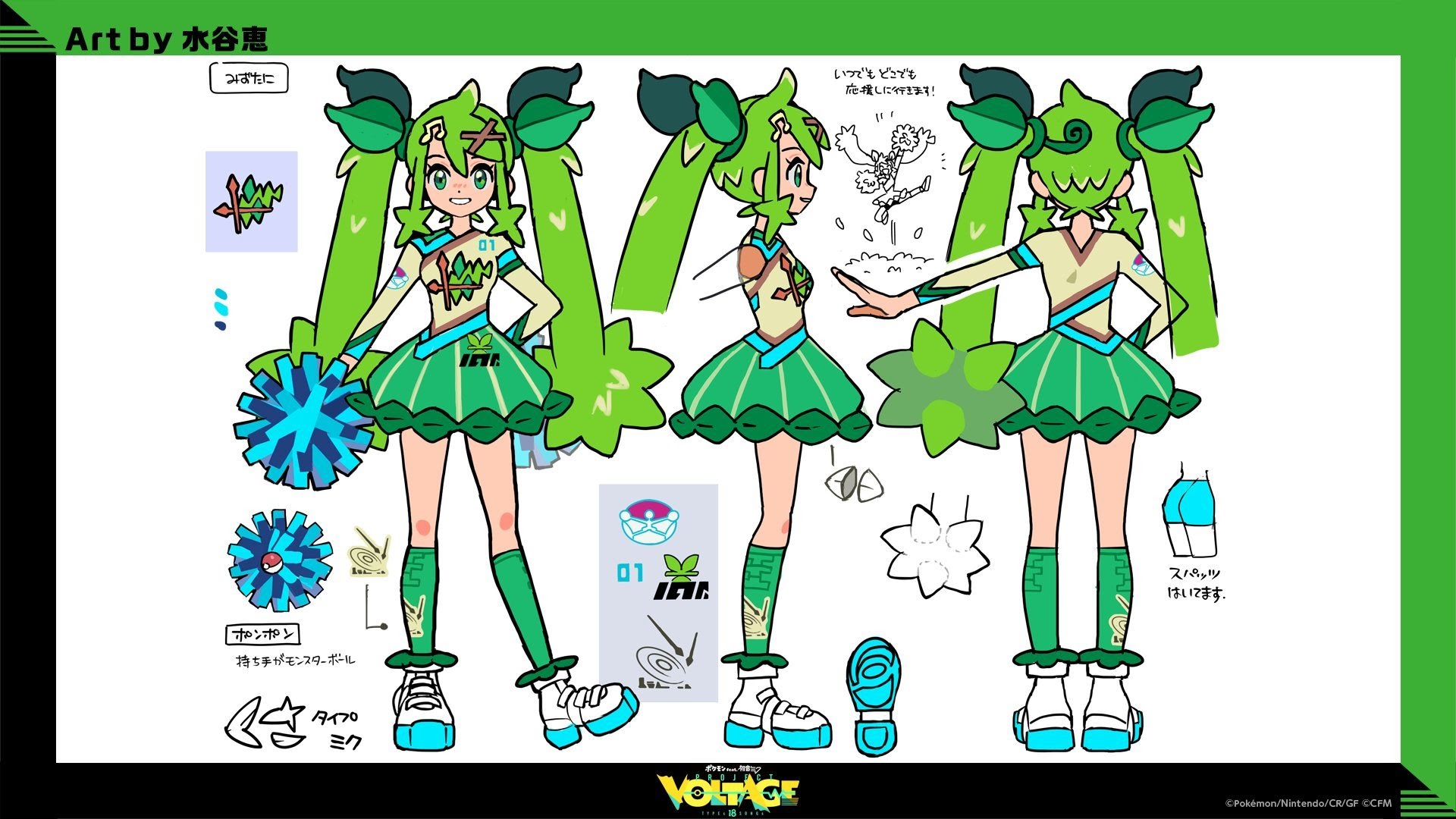
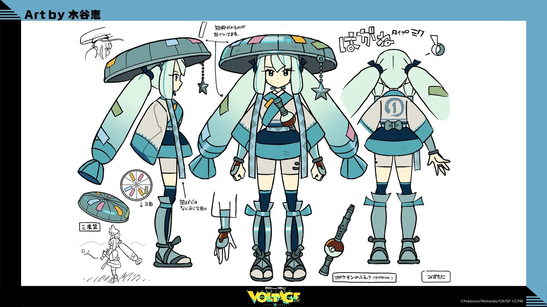
Rank 18: Grass (Average: 2.79)
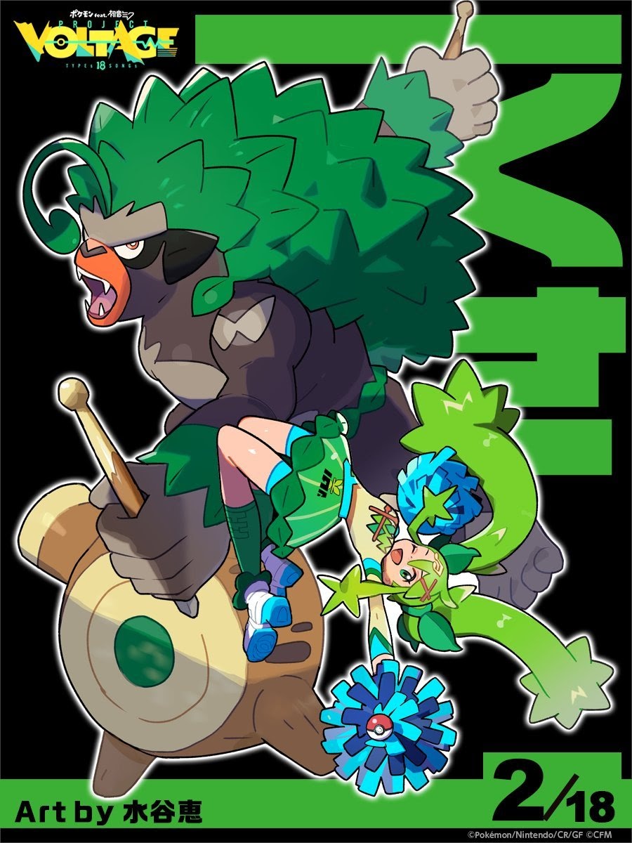
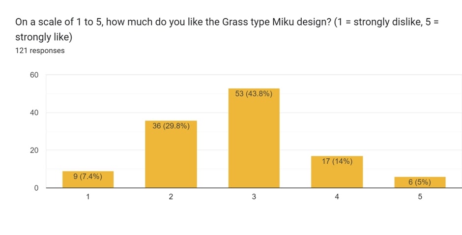
The Grass-type design, by Megumi Mizutani, was the second revealed in the collaboration. Firstly – while it was the least popular in this poll, it still had an average of more than 2.5. That’s not too bad! This suggests that there weren’t any designs that everyone disliked. Here, you could say that most votes were neutral – 3 was the most popular option here, with a trend more towards ‘slightly dislike’ than strongly dislike or otherwise. It also had by far the least number of ‘5’ scores.
There was little in the way of comments from voters on this design. Besides a note that it was a sporty design, there was one outright opinion given:
As a huge fan of the grass type, I was really disappointed how little I like her design for it.
There was little separating last place with the next placing…
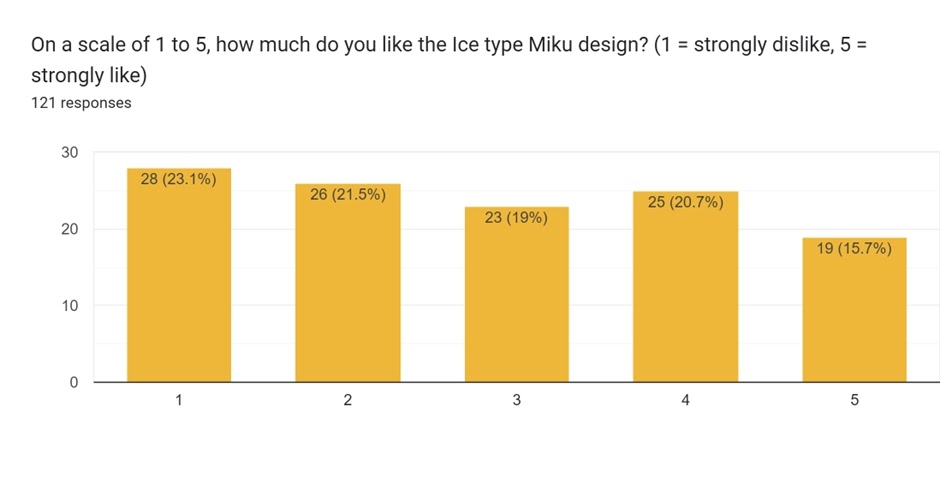
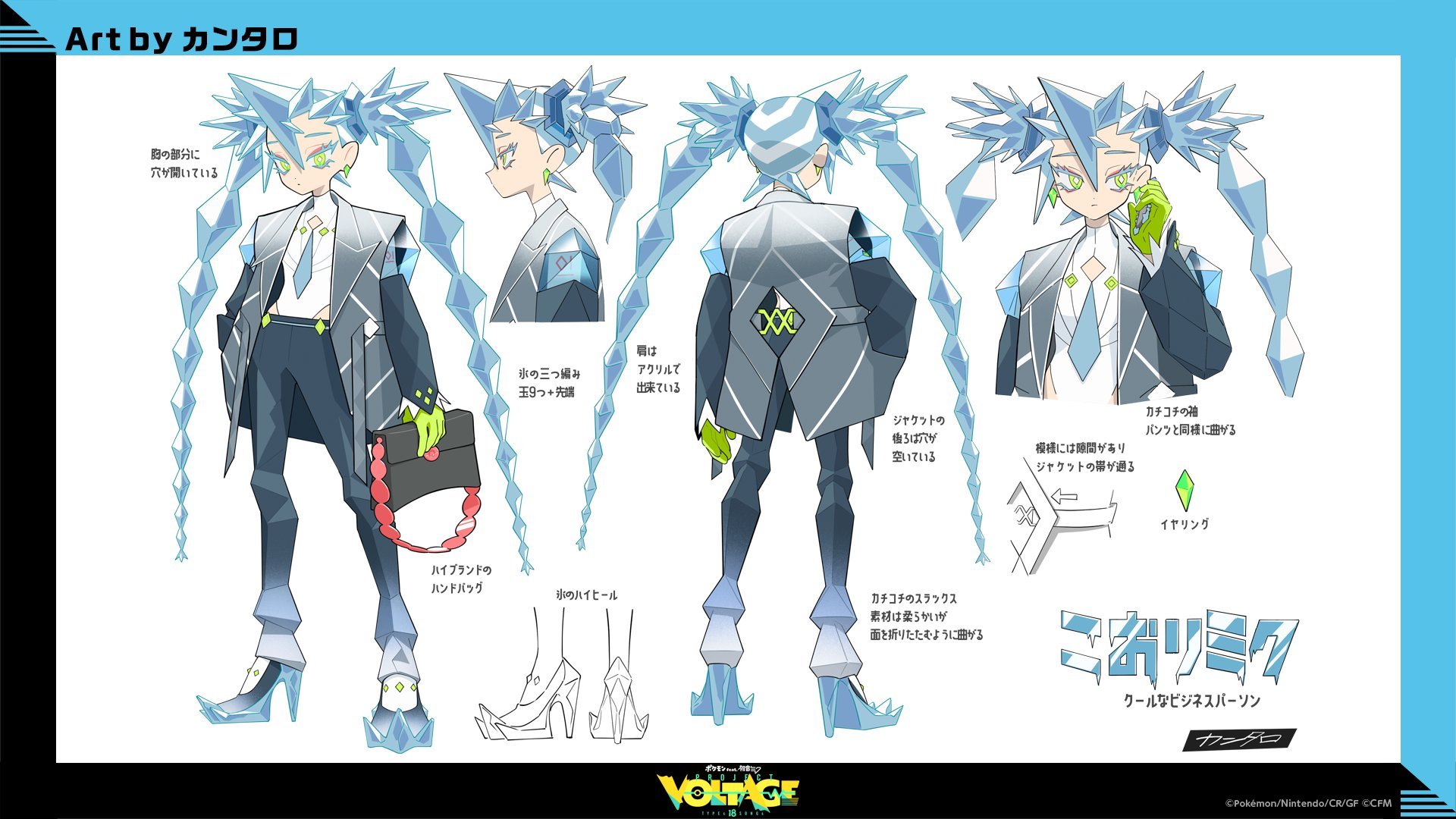
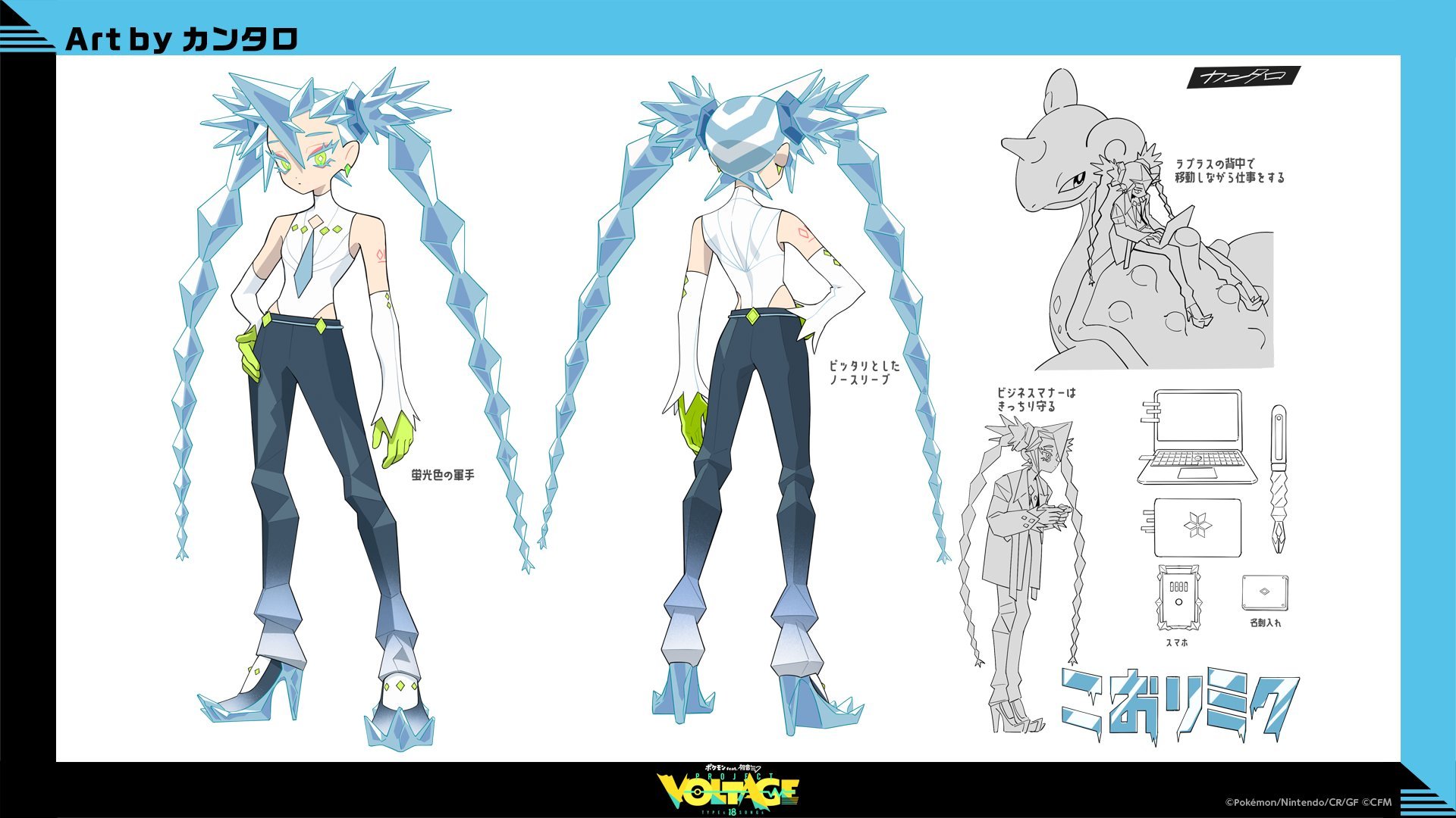
Rank 17: Ice (Average: 2.84)
 Concept art (2 , 3)
The Ice-type design, by Megumi Mizutani, has a very different distribution in votes. No score had less than 19, nor more than 28! Unfortunately for this design, it was the score of 1 that garnered the 28 votes, the most of any design. This was a more polarising design than most others, and also had the equal third-lowest number of 5 scores.
Unsurprisingly, there were a lot more comments offered here than for Grass.
I love most of them but the ice one is too spiky
My only ones that I can say I wasn’t a fan of were Poison and Ice. Their designs just seem a little too forced into the archetype of their respective types.
Ice: Don’t like the design, it feels more rock type than the rock one, it looks completely disconnected to the lapras design and style.
The design is not without support however:
Ice Miku has that ‘girlboss’ energy that everyone keeps talking about. At first, she was kind of okay but she’s really grown on me. The colour combinations are so clean, the shapes and textures for her hair and clothes, the absolute BALLER stance that I can’t adore more.
I really like Ice type Miku the most because her design is super cool, especially how it gives off some masculine energy which we don’t see often in Miku designs!
A bit of breathing space followed for the next placing.
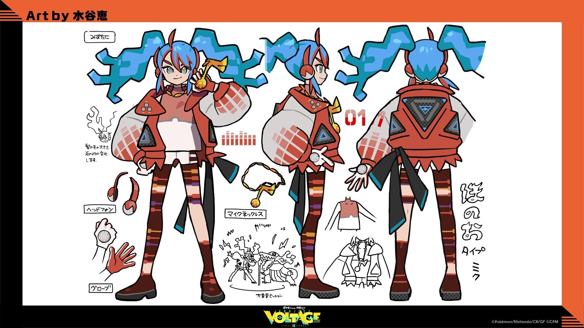
Rank 16: Fire (Average: 3.17)
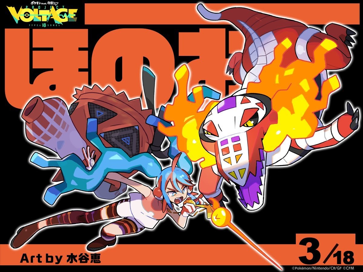
The Fire-type design, yet again by Megumi Mizutani, was the third revealed in the collaboration. It has a very Bell-shaped curve – 55 votes for a score of 3, which was the highest. In contrast, there were only 5 and 12 votes for scores of 1 and 5 respectively. Right in the middle, which does mean this average score of just over 3 fits.
Given most people seemed fairly neutral on the design, there was little said! One person did state:
Fire and Water accurately represent their types
And that’s all that was remarked. What about the next place?
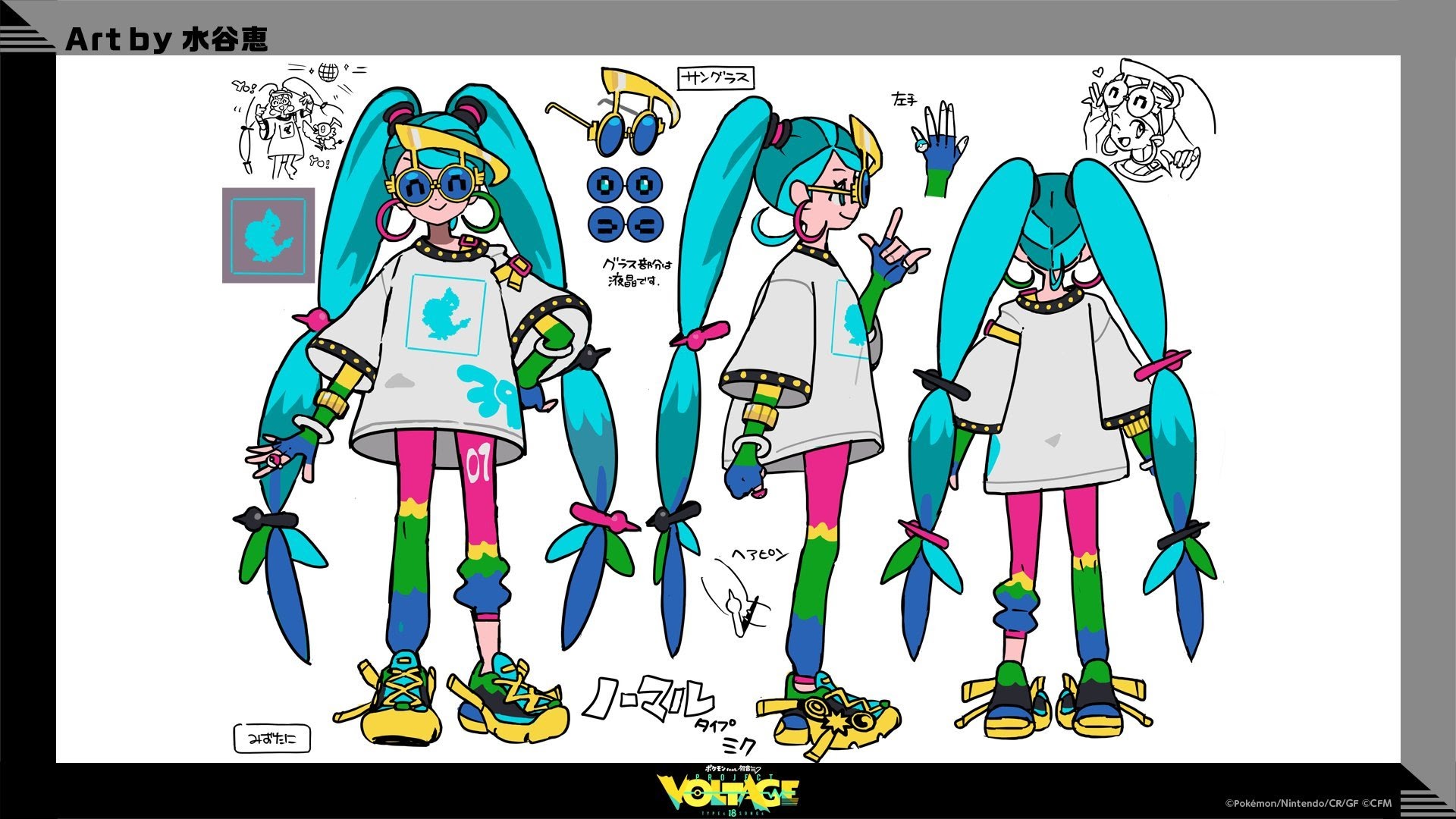
Rank 15: Normal (Average: 3.30)
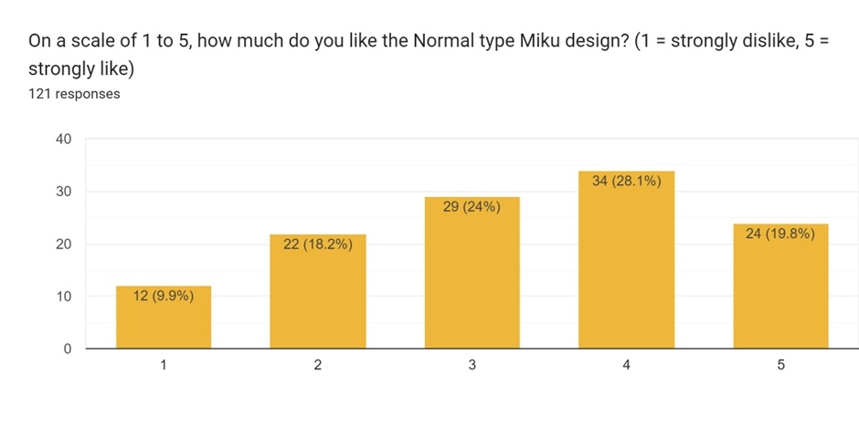
The Normal-type design, yet again by Megumi Mizutani, was the sixth revealed in the collaboration. It trends upwards to peak at a score of 4, but then dips – around a fifth of respondents strongly liked it. Over a quarter disliked the design at least a bit, although it’s hard to deny that Chatot is a fitting Pokémon for the collaboration.
Given the spread, the comments that were offered were mixed as well. Some liked the creativity; others thought it was a bit much, such as this participant:
The normal one isn’t really that good either, but its ok. Whys normal type not look like normal at all??? Thats the one time it works perfectly, being unique didn’t help them here in my opinion.
On the flip side, another embraced it:
I love how colorful and gaudy both Normal and Poison look.
And speaking of Poison…
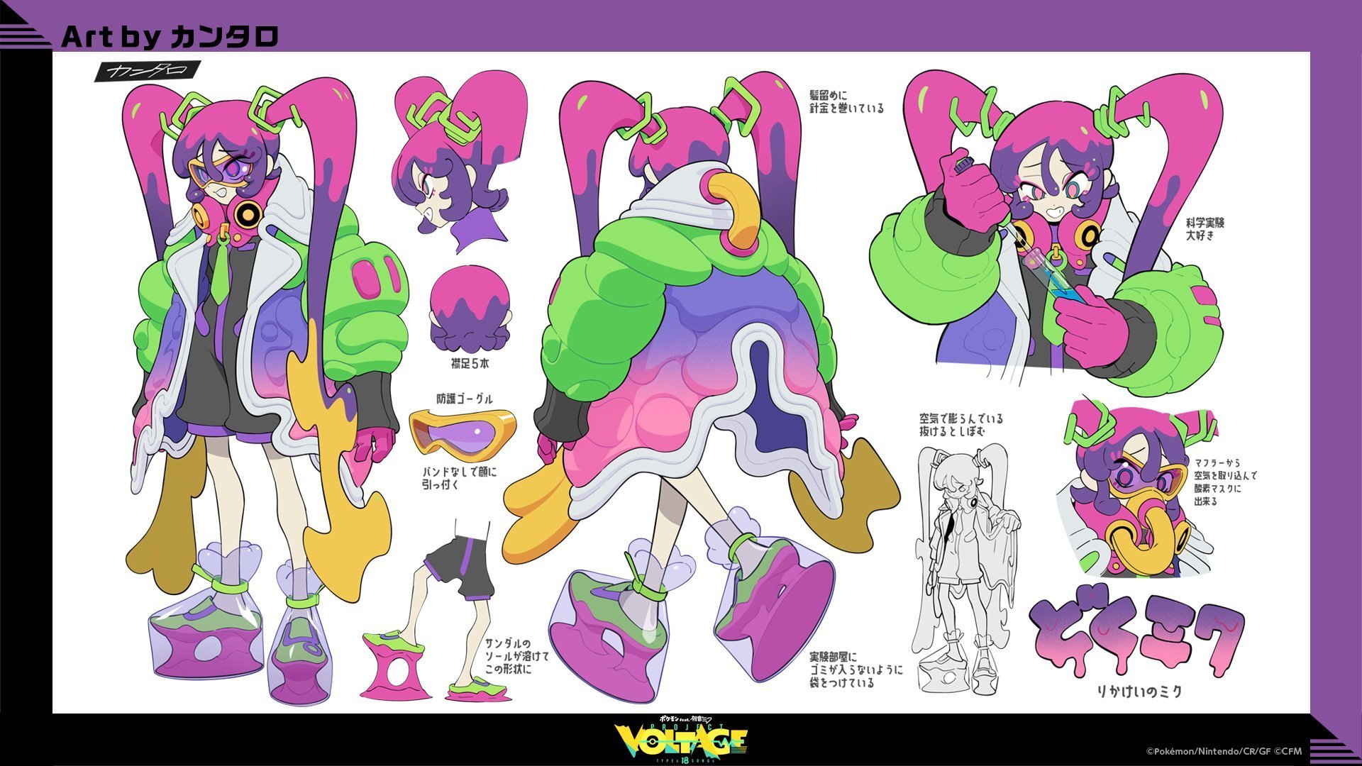
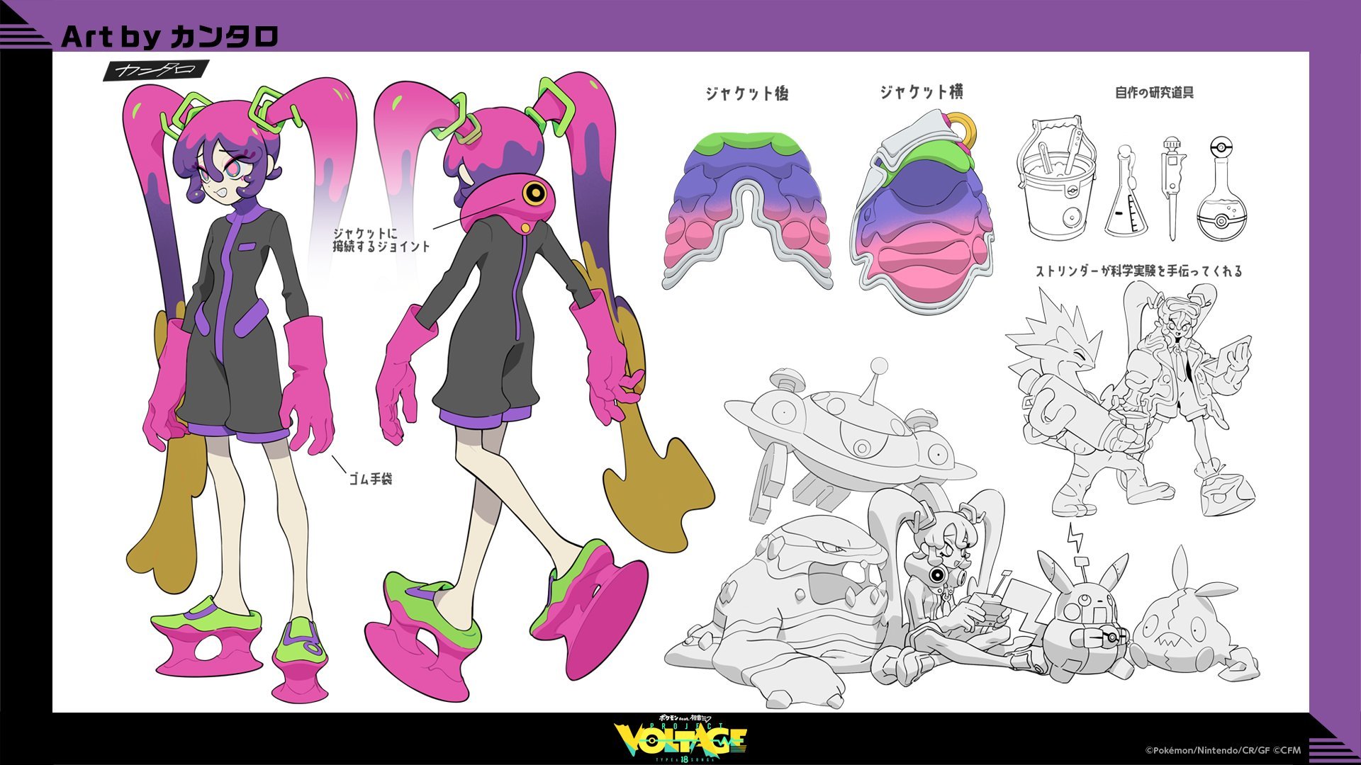
Rank 14: Poison (Average: 3.36)
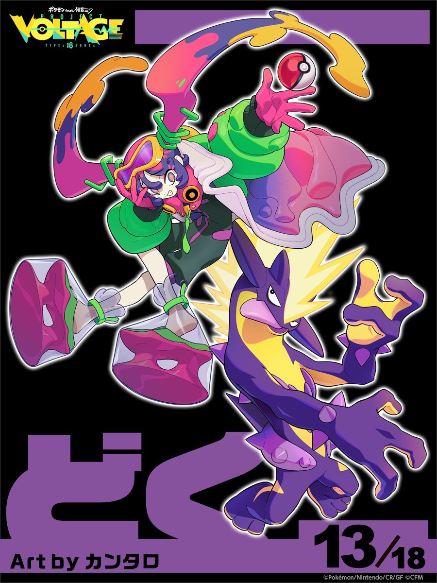
 Concept art (2)
The Poison-type design is the first in our rankings made by a different artist, kantaro! The average score was not much higher than 15th place, but it has a similar shape to it. 4 was the highest placing score again, but we lost some of the 2s and 3s. In fact, this design had the second highest number of 1 scores. Talk about divisive!
This was reflected in the comments too. Here are some of them:
Poison: What are those shoes? Throws too many colors together haphazardly too.
I thought poison and normal type Miku were both really ugly
Poison: Hate the shoes, the rest is good.
poison miku is bad because of the amount of saturated colors, it was hard to decipher what was going on.
A little too flamboyant for my tastes, but I do see why people like her. Funky for sure.
There was only a 0.3 average score difference between Poison and the next two placings!
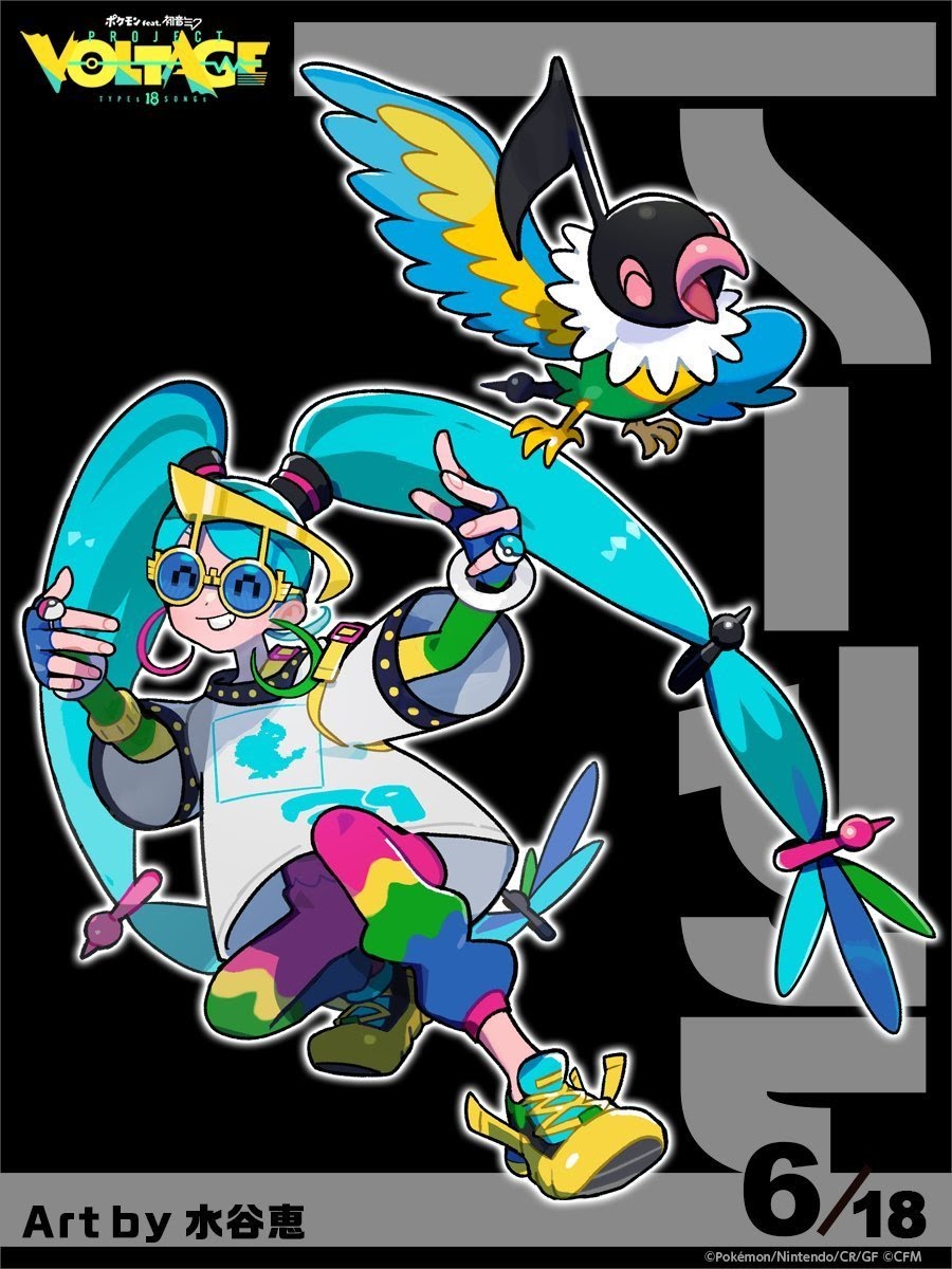
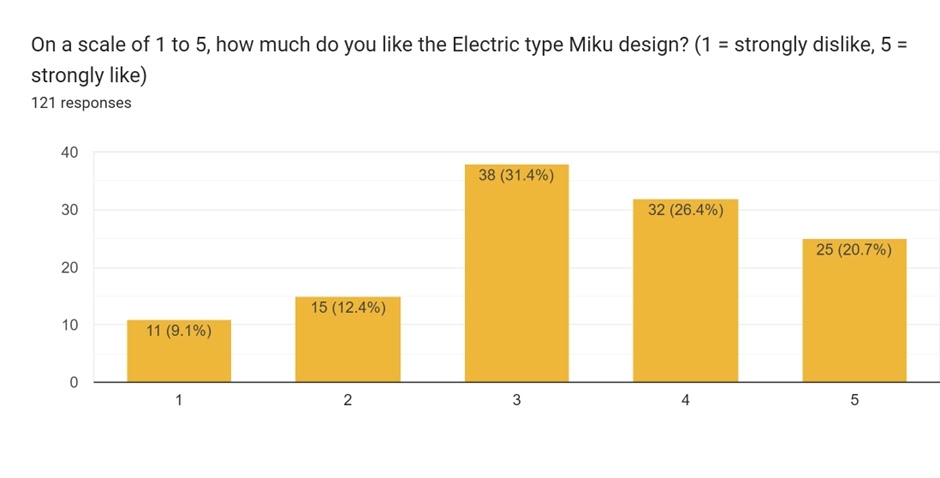
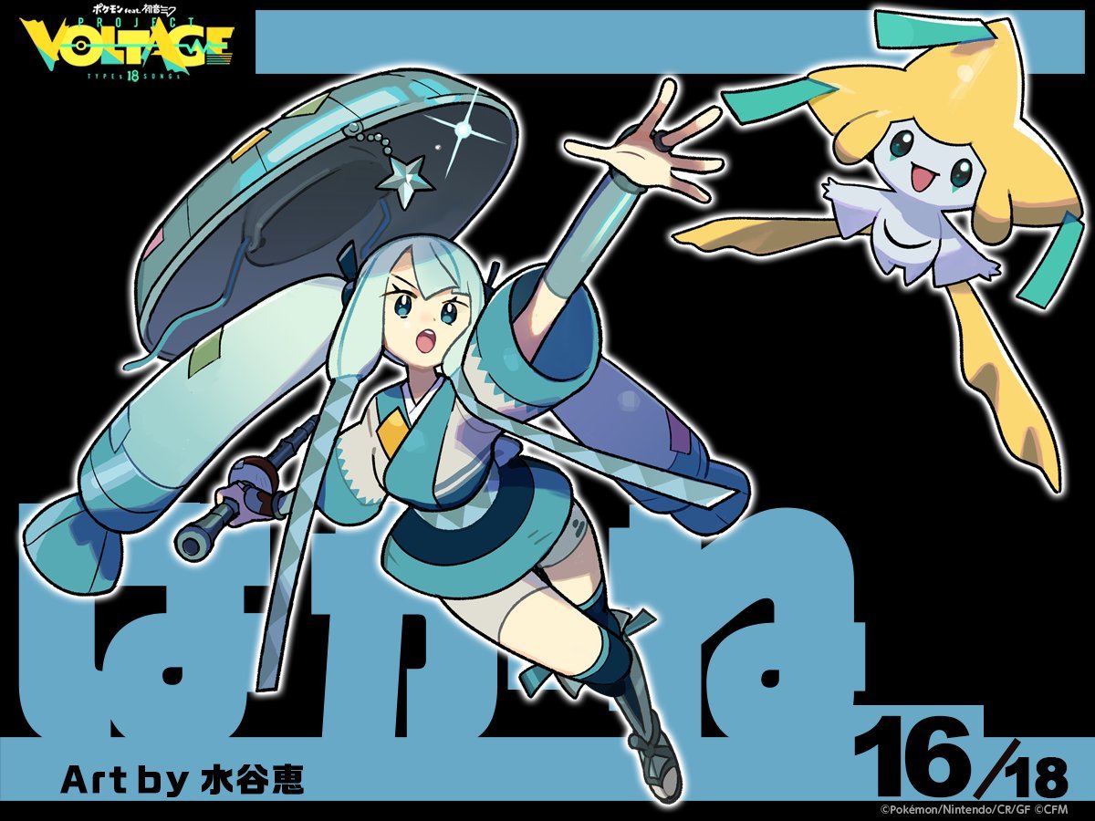
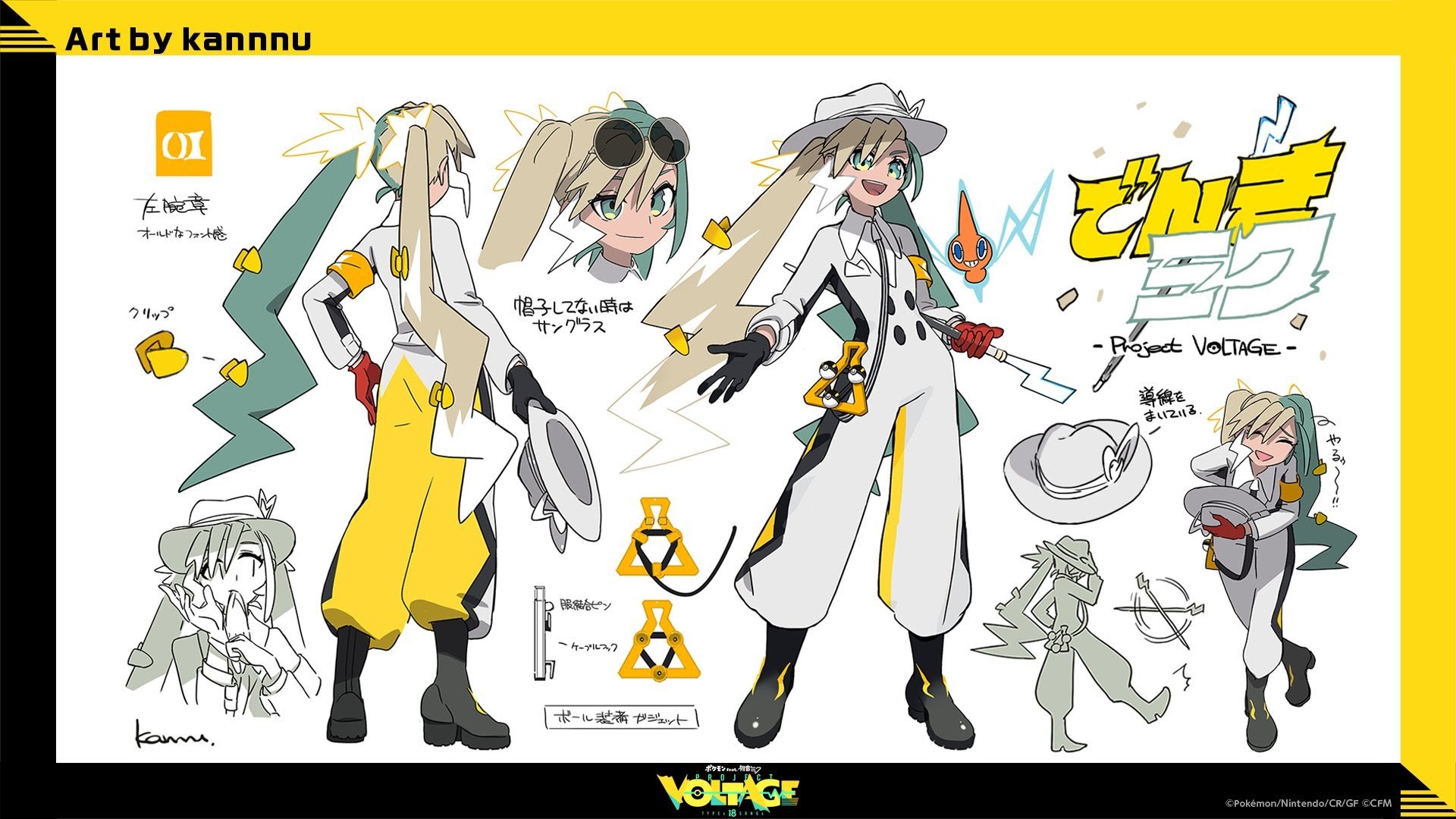
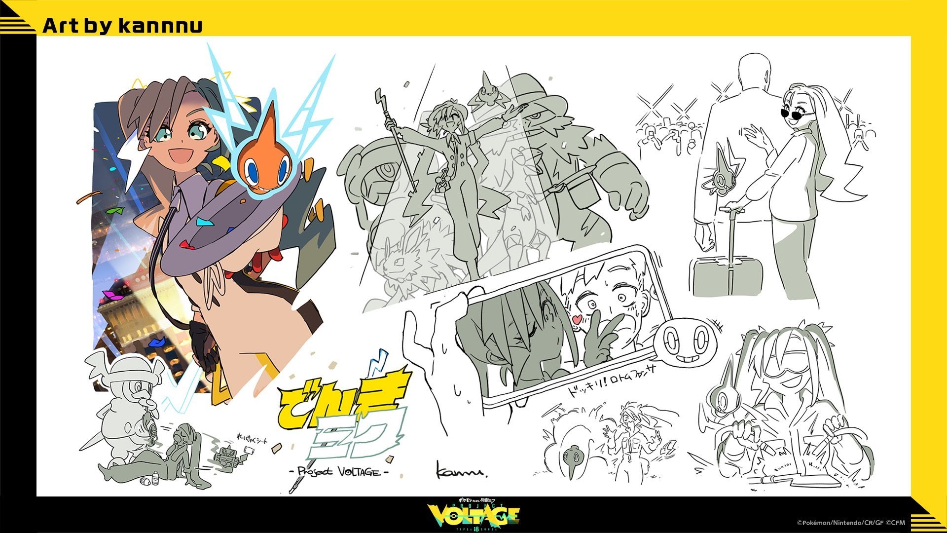
Rank 13: Electric (Average: 3.38)
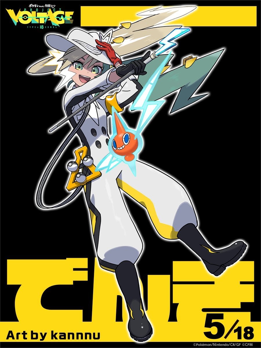
 Concept art (2)
The Electric-type design was made by kannnu, the sole design they did for the collaboration. The average score here indicates most voters were content to give it a 3, but the rest did skew towards the higher end.
There were a few comments that stuck out, mostly because of the difference of opinion between the first two and the last:
Electric-Type Miku I don’t really like, because of the exact opposite. Miku is barely recognizable as such at all, while the Pokémon (Rotom) feels very neglected. I feel like you could have done a lot with Rotom to make the whole thing a bit more “Wow” so to say. As it is it feels a bit underwhelming in the combo and design standpoint.
Electric: Don’t like the design (Remove the lightnings, and it feels more like a cowboy), the colors feel more like a ground type trainer and I don’t like Rotom as the chosen electric Pokémon (it could have been used better like possessing a microphone or other musical equipment or used other electric type Pokémon).
Electric Miku has that showboat confidence that makes her seem so vibrant and pleasant; she lives to perform, she lives for the stage, she’s on top of the world and she KNOWS it.
Just above it by 0.1 is…
Rank 12: Steel (Average: 3.39)
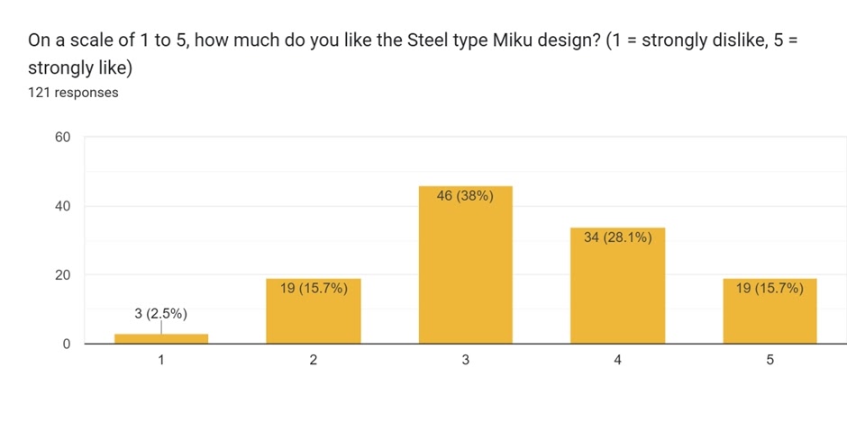
The Steel-type design was also made by Megumi Mizutani. It had more 3s than Electric, but only three participants stated they had strongly disliked it. This is the last design where we see a 3 score dominate so much.
A couple fans felt other Pokémon may have worked better:
I think that bronzong might have been a more fitting choice for steel type
Steel type Miku is also one of my favorites. At first I didn’t mind it much, but it eventually grew on me. I feel Celesteela could’ve been a better Pokémon choice than Jirachi (choice I don’t really get) since Miku holds that bamboo-ish katana.
While another was happier with the choice of partner here given the design.
Steel-Type Miku’s Design I also like. Miku’s recognizable as such and her design both shows her origin from Japan with the kind of Samurai-like style, while incorporating a star to connect it to her partner Pokémon (Jirachi). I definitely don’t think it was perfect, you could definitely make the pairing of her and her Pokémon better, but it’s still a close 5 for me.
The next one brought about some interesting comments too!
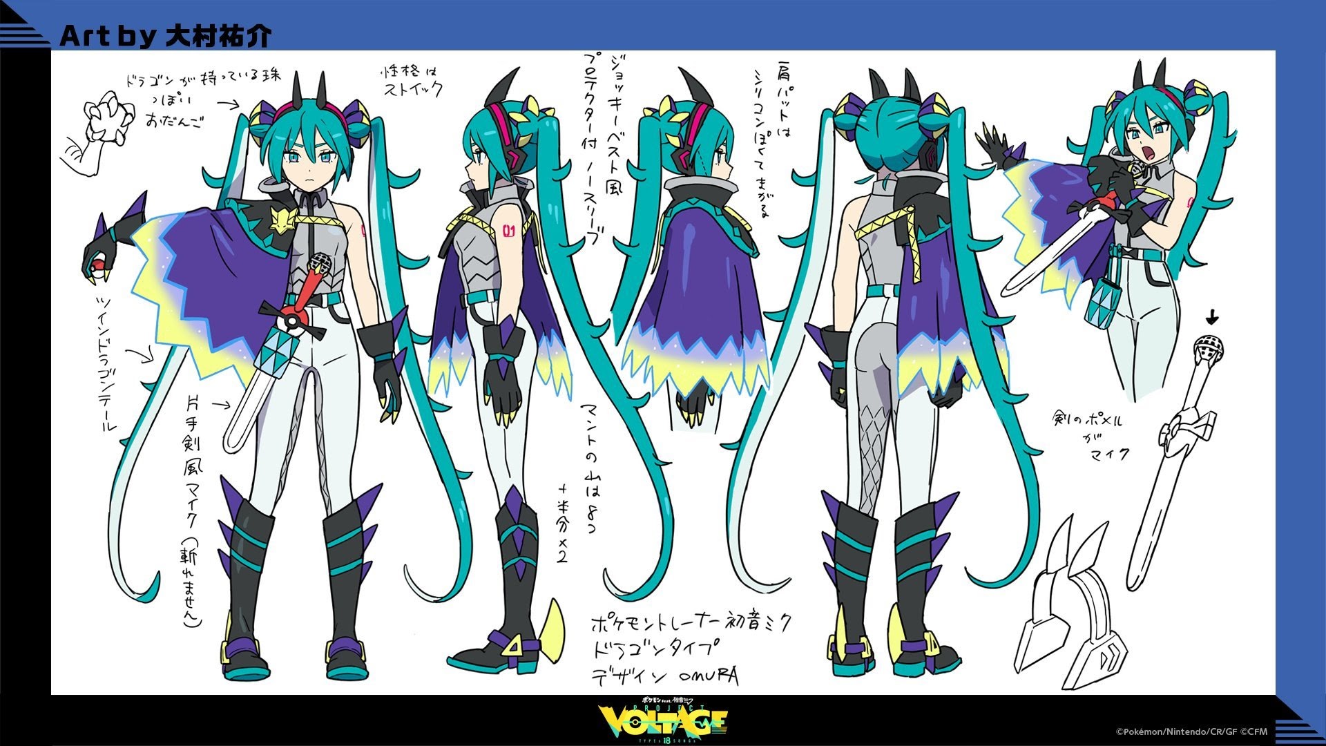
Rank 11: Dragon (Average: 3.45)
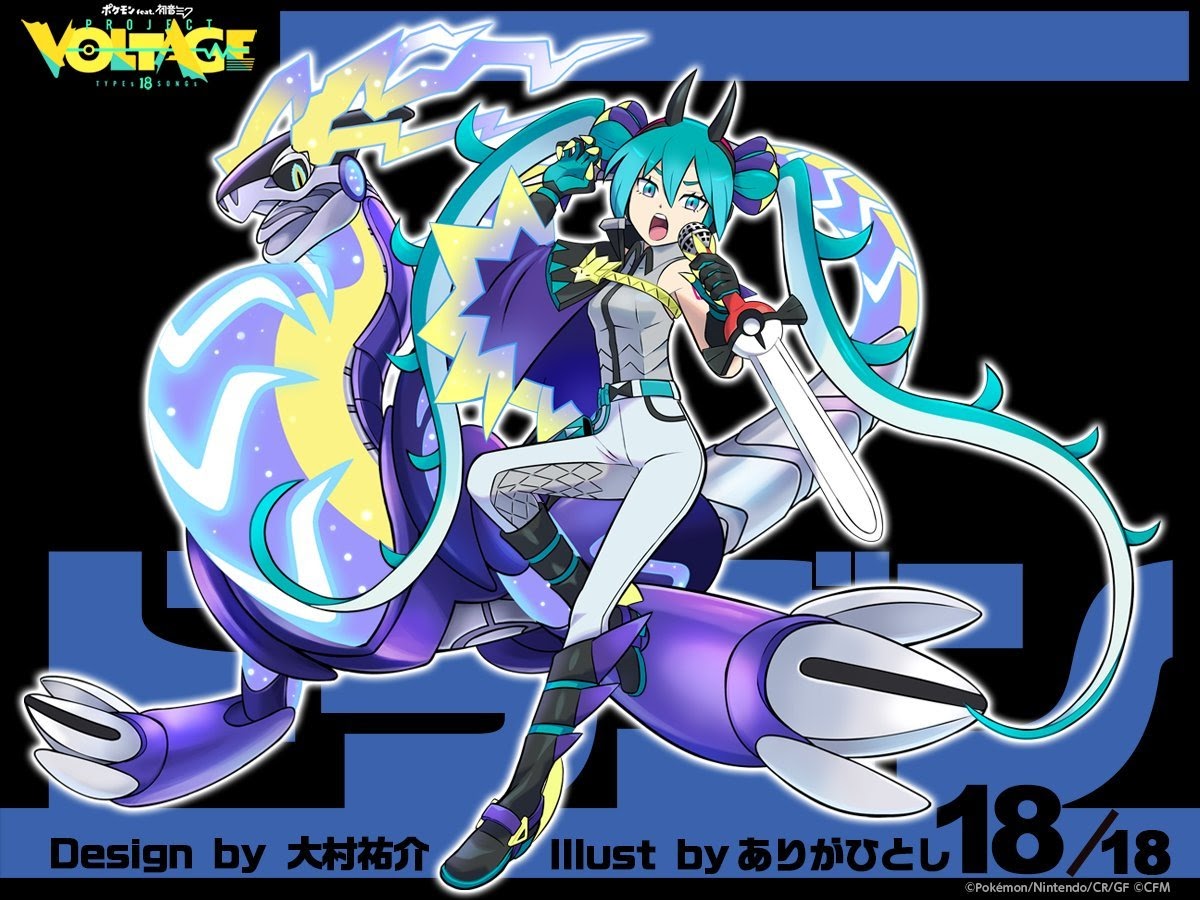
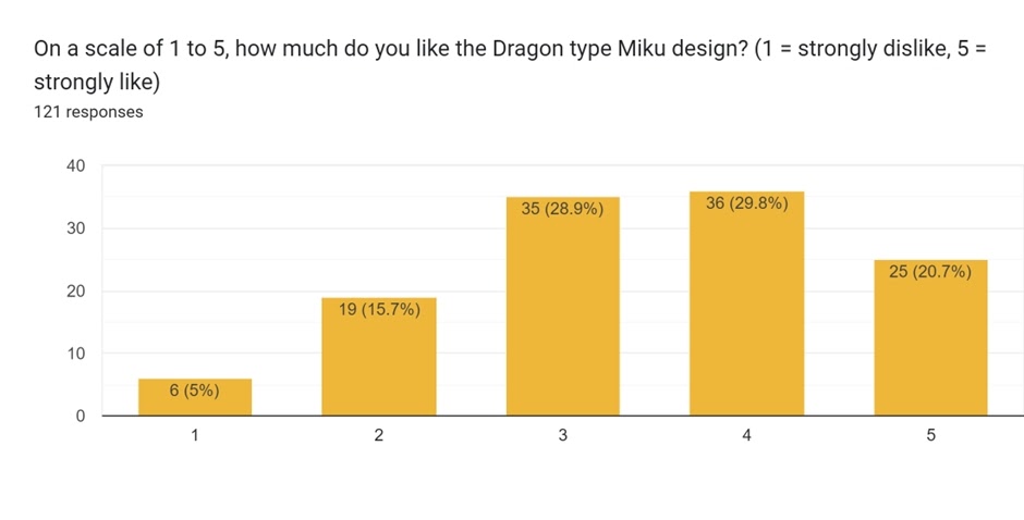
The Dragon-type design was made by Hitoshi Ariga, the sole contribution they made to this collaboration. Interestingly, this was the only art that noted someone else for design credits: Yusuke Ohmura, a Game Freak illustrator and designer who did several Pokémon (a few Water-type Starters and a few generation 6 and 7 Legendaries). Perhaps this Pokémon choice was instigated by Game Freak…? Scores of 4 just edged out 3 for the most voted for.
Certainly it makes sense that they would have gone with a generation nine ‘mascot’ of sorts in Miraidon for at least one type design, particularly the last to be revealed. But this generated some interesting comments:
Dragon was a wasted opportunity compared to the others, specially the mon choice and the extremely generic dragon outfit
Dragon Miku is my least favorite, mainly because it’s boring? I get why Miraidon was the Pokémon choice, but I don’t think the Miku design had good synergy with it, it looks like generic Dragon type trainer for me.
Oh well, can’t please everyone. How did the next placing fare?
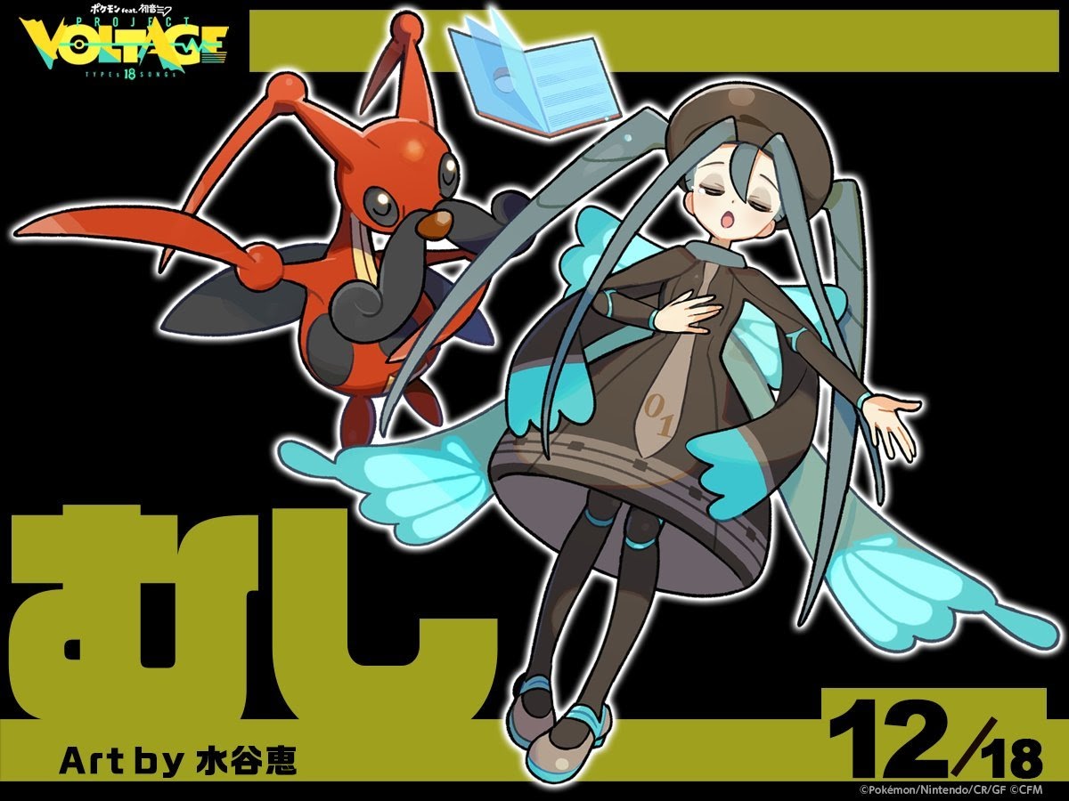
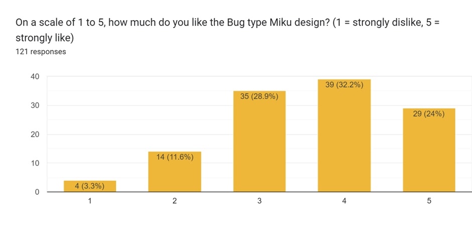
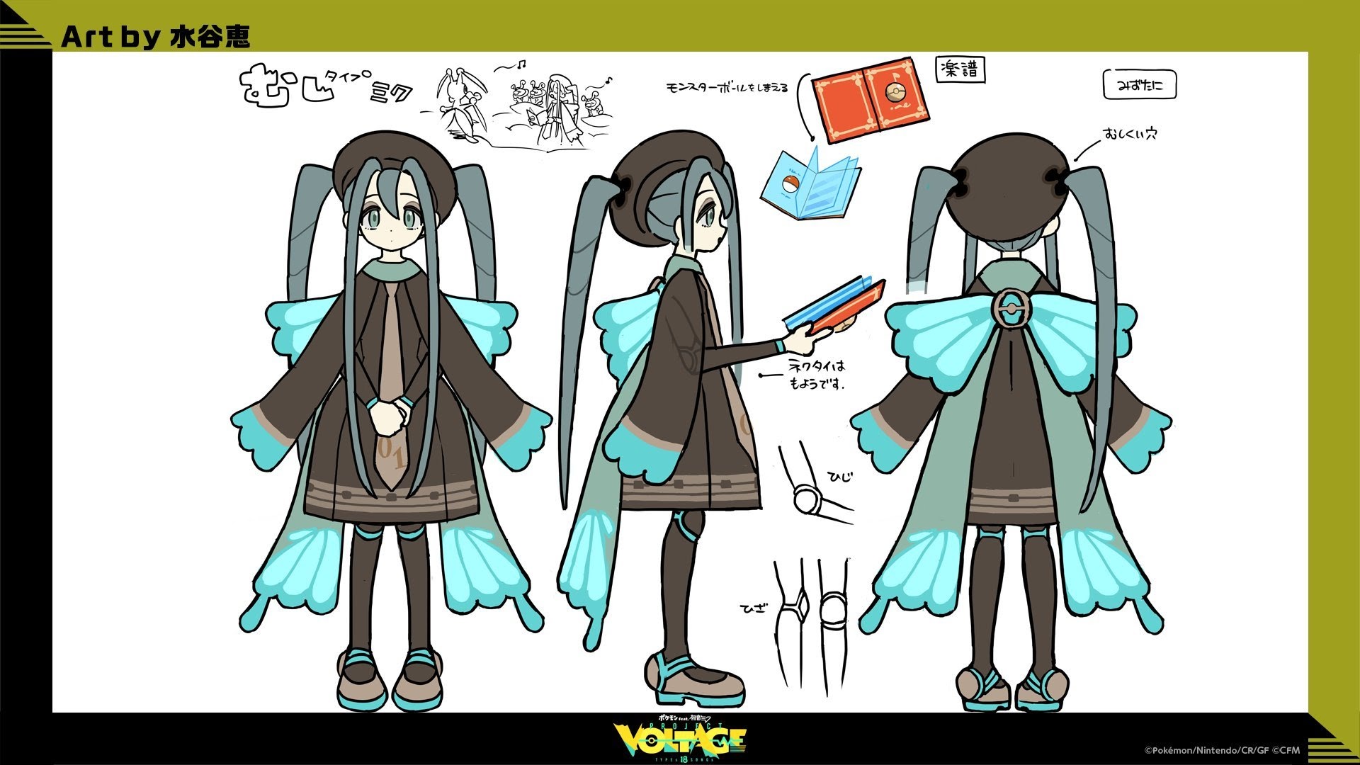
Rank 10: Bug (Average: 3.62)
The Bug-type design was made by Megumi Mizutani (they did make most of the designs – eight in total!). Only four people had strongly disliked this design, and over 80% gave it at least a score of 3.
Kricketune is certainly a fitting partner for Miku as well! Another participant agreed:
I love the bug one, nice to see my boy kricketune!
Another added:
The bug type one is peak! :D
Its average score however was just 0.2 away from making the top half (9th to 1st). Who beat it? Check the next page!