The curious development of Sneasel
Sneasel is a living fossil that tells us a lot about how Generation II itself was developed, and how the very concept of what being a Pokémon meant evolved over time.
So, let’s talk about Sneasel. It’s an Ice/Dark type introduced in Generation II, but I’m sure you all know that already. No, this time I want to talk about one of the most interesting facts about this little chilly trickster: that it’s one of the most complex Pokémon to ever be designed. Sneasel is, surprisingly enough, a living fossil that tells us a lot about how Generation II itself was developed, and how the very concept of what being a Pokémon meant evolved over time – even after the games themselves had hit store shelves. It also has Beat Up as a signature move. I like that one.
Pokémon Gold and Silver are some of the most interesting games in the series. And not just because of their quality, or all the features they added, most of which have long since become staples in the franchise. What makes them especially interesting, in my opinion, is their curious development, one that went on for a surprisingly long time for a Game Boy sequel built on an existing engine. Sure, Red and Green took even longer to make, but Game Freak really had no idea what they were doing and weren’t exactly long on money. By 1996, when the next generation of games went into production, they already had a success on their belts, and a fully-built engine to work on.
I have already talked about how the world map went through several revisions before release in this piece, with massive changes and redesigns that hint at how their ideas of what the games were going to be all about kept changing over time. Turns out, the overworld was not the only part of the game Game Freak kept rethinking and redesigning. The Pokémon list also kept suffering changes.
Since a hacker leaked several demos and development betas of the games, fans have been looking at all the designs that fell by the wayside, like the adorable Kotora and its evolution, or pre-evolutions for Meowth and Vulpix, or even concepts of what would eventually become Leafeon and Lickilicky two generations later.
The very oldest Pokémon list features lots of strange concepts that barely look like current-day monsters, most of them disappearing without a trace in the following updates. Only a very few select Pokémon remained from their very early concepts until the end, mostly with very few changes, such as Chikorita, Marill or Octillery. Others went through some redesigns but were eventually dropped, and new monsters appeared late into development to take their spots with far more success, which were the ones we discovered when we first played the games.
One of them, though, is in a group of its own. Sneasel is one of the very few Pokémon that appears in every single iteration of the list, with a different design in each one. In total, between its first appearance until its modern design, which it gained in Crystal, Sneasel went through a whopping eight different versions – easily a record. But the most remarkable fact is, perhaps, that its name and identity were already set from the beginning.
The first step: the cuddly, clawy weasel
Sneasel appeared for the first time in the famous Spaceworld 1997 demo, at the very end of the Pokémon list (number 246). At that point, it was a nice, smiling fella, inspired on a weasel, including a long tail and whiskers. Frankly, it could hardly be described as anything else other than very cute. But most importantly, it looked like… a perfectly normal cartoon animal, with some small touches to make it look “Pokémon-y”. Think of Pidgey, Seel, Krabby, Persian, Ekans – all Generation I Pokémon that have that same inspiration.
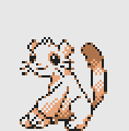
In this case, its identity seems to be built around its pretty sharp claws. Its strongest attacks, learnt at levels 42 and 48, respectively, were Fury Swipes and Slash, making it pretty obvious that, at that point, the entire concept of Sneasel was “a weasel with big claws”. While it does learn a couple of dark attacks (Faint Attack and Pursuit), it’s hard to describe its appearance as anything other than a Normal type. Of course, Gen I had enough Normal Pokémon resembling regular animals, so yet another one was hardly necessary.
But there’s something else behind the idea of “a weasel with sharp claws”. It’s a yokai, another known source of inspiration for Pokémon: Ninetales, Slowbro, Drowzee, Exeggutor or Jynx were already inspired on the monsters of Japanese legends. As M. Lucero describes in this article,
Kama itachi, literally “sickle weasels,” live in cold, mountainous places where they travel in threes and form whirlwinds, attacking people as they pass, then using a magical salve to heal the wounds they have caused. This yōkai is probably an explanation for the way a cold, icy wind feels like it cuts one’s skin even though no apparent damage has been done.
This description would match pretty well a Dark/Ice weasely monster with a sneaky and trickster personality, as described by all its Pokédex entries. The problem is, the cute boy we had on its first design doesn’t seem sneaky, or the kind of animal to steal and eat eggs from other monsters’ nests. Or an Ice type, for that matter. At that point, Sneasel could have gone the way of so many other early Gen II designs, and end up being discarded. But someone liked the concept behind it and decided to keep working on this cute boy to make it less cute.
Let’s get mischievous
After the first leak, new ones followed. And those new development files included several scratchpads in which you can see different, discarded designs for each Pokémon. In some, you see old monsters that were removed altogether. In some others, you see beta designs they had been working on. Sneasel is one of these. And these unearthed early designs show that Game Freak liked the concept and was now trying to get that cute boy to look like a mischievous spirit. This was their second attempt.
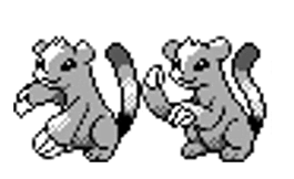
As you can see, their first idea to make Sneasel look like the kind of spirit that would randomly slash people and steak other species’ eggs is changing its eyes and mouth. Gone are those big ol’ round eyes and that pure smile that made it look so cute. In its place we see a literal “>:3” emoticon – furrowed brow, eyes with a diagonal shape, a cat smile. And yet, interestingly, its cattiest feature – the whiskers – has been removed.
Then, the claws are featured more prominently. In the first version, the right arm has gone from being hidden by the left to being shown clearly as well, hinting at double the threat. The second design (maybe an alternate Silver pose?), whilst also clearly an edit of the same sprite, makes some changes to the arms, the tail and the ears, which are now bigger and rounder. Still, there’s something clear: this Sneasel still looks like a real animal. And it’s still hard to pin it down as Ice-Dark.
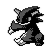
Big Grin
By August 1999, three months before the games were released in Japan, two things were clear. One, that Sneasel had survived long enough to join the final roster, since that year’s Spaceworld demo featured all the definitive 251. And second, that, like a handful of the finalists – including Wobbuffet, who back then was just a shapeless white blob -, Game Freak was still far from settling on a definitive design for it. Much like Aipom, who had a similar development, its sprite sheet was a mix of its original backsprite from 1997, its Silver pose from the intermediate stage we just saw, and a newer design that was being tested on the Gold frontsprite. This one.
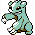
This is pretty much an edit of the same old sprite, but the changes are already adding up. First, most prominently, the cat smile has been replaced by a more sinister grin and the tail is now gone. Its ears are slightly spikier, and now it has three hair bumps instead of two. Most remarkably, its palette has gone from Normal-type white and brown to a tone of blue that more closely indicates Ice, and even perhaps Dark. Still, it’s clear that they were far from satisfied, and yet the clock was ticking: they only had three months left before the games were slated to release. And so they decided to keep trying new things and see if any stuck.
Dark Chao Sneasel
The next design is a fascinating move. At its core, it’s little more than just another edit of the original sprite. And yet, looking at it, I can’t help but think of the fact that Sonic Adventure for the Dreamcast had been released one year before this design popped out.
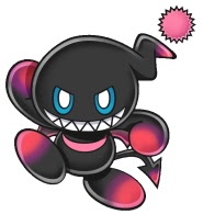
Okay, okay, it probably is just a coincidence – after all, Dark Chao was introduced in Sonic Adventure 2, which came out in 2001. So, unless someone at Game Freak was looking at Sega’s concept designs, chances are the similarities aren’t intended. But still: the grin is now wider, the half-lid side of its eyes has been flipped for an eviler look and they have gained irises, and the hair bumps are now a long fin-like ending that is reminiscent of a Chao’s (or maybe it’s a hedgehog-like clump of spikes?).
Either way, it’s been a long way since the cute, smiling boy from the beginning. This one certainly looks like a Dark type (all that Shadow black!), and it’s really hard to guess that the base sprite was that of a cartoonish, but otherwise realistic, weasel. Maybe someone could have said “good enough” and we would have spent a couple decades wondering whether Sega took some inspiration from a Pokémon to make one of their characters. But someone looked at it and said “the darker colour is a good idea. But rather that keep editing the same old sprite to death, maybe we could start from scratch?”. That was less than three months before the games were slated to come out. And so began a last-minute rush to come up with a proper Sneasel.
Sugimori steps in
This part is a bit of speculation, but it’s supported by two facts. First, the complete overhaul of Sneasel’s design, bringing it more in line with the style a majority of Gen II Pokémon had by that point. Ken Sugimori was known to have worked on or helped redesign most of these (most early Gen II designs were by Atsuko Nishida and Shigeki Morimoto, meaning they would need some small touches to be consistent with Sugimori’s style, and we know most got them). And the second is that its final design appeared for the first time in an official artwork drawn by himself. So it would seem that Sugimori, the series’ main designer, decided to step in and fix that Pokémon, as they were putting the finishing touches on the roster. To put it in perspective, by Spaceworld 1999, only 11 other monsters needed major redesigns: Chinchou, Azumarill, Sunkern, Lanturn, Aipom, Wobbuffet, Dunsparce, Tyrogue, Hitmontop, Larvitar and Celebi (many others, like Remoraid, Wooper or Shuckle had a clear concept that needed fewer changes, or were already undergoing them).
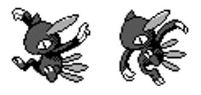
This finally looks like the Sneasel we know and love, but on an early stage. The long ear appears to be sticking entirely out, its face is entirely smooth, missing the jewel it has in the final, and it also lacks the other jewel in the chest. The feathers on its back are also entirely plain. And the pupil is very narrow and fills the entire eye’s height.
And yet, perhaps the most interesting fact is that it has an alternate pose that would have worked as a Silver sprite but that eventually went nowhere. Why? Well, we can’t know for sure, but we can make an educated guess: they were running out of time.
“Look, just ship whatever we got”
How many different versions of the same sprite can you make in a few weeks, while you’re putting the finishing touches to the game? The answer is, surprisingly many. This version is yet another edit, this time of the second design, which is far more abstract and ‘Pokémon-y’ than the original weasel concept.
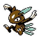
This sprite is a just slight modification of the previous one. It gains a white circle on its forehead and the ear is also tinkered with, to make it feel properly connected to the head and not an attachment.
But, obviously, the most remarkable change is the colour. While we can’t really tell the actual palette of most previous forms, we do know that the first design was white and brown, and that subsequent ones got a blue and then dark hue. This one seems a curious mix: a very strong brown with white highlights and blue feathers. Maybe its first ‘modern’ design already looked like this, but we don’t have its correct colours.
The result was something pretty fascinating – a Pokémon that was included in the games before its final design had been completed. One of the well-known easter eggs from Gold and Silver is that Sneasel appears brown on it instead of its actual colour, dark blue. It’s not a mistake, or at least it wasn’t at that point. It’s just that they had to call it off and ship the game before they actually finished redesigning it for a fifth time!
Second chance for a final Sneasel
But, thankfully for the team, they had one last chance to improve that sprite: the international versions would come out a year later, enough time for some fixes and minor improvements. Many Pokémon got some minor touches, such as Lanturn, Pichu, Feraligatr, Aipom or Sunkern. Incidentally, most of them were the ones whose designs weren’t fully finalised by the Spaceworld 1999 demo! It seems they really ran out of time while working on them. And Sneasel was clearly one of this group.

The main changes are very simple: another white spot is added on its chest, to match the one on the forehead, where jewels will eventually appear. And the eyes are redesigned, so they no longer look like a vertical stripe cutting the socket in two. And… this was good to go! Or maybe they just literally ran out of time (again), since the cartridges had to be manufactured in Japan and shipped across the world in time for the release. And so this is the sprite we all saw in our Game Boy Colors all those years ago.
What we do know is that, after the game was published in the West, there was yet another redesign. Sugimori released Sneasel’s official art and it looked very different to the one we had seen in the games. And so, when Crystal came out, the sprite was changed yet again. And this last time, for good.
Sneasel-final-complete-definitive-fixed.doc

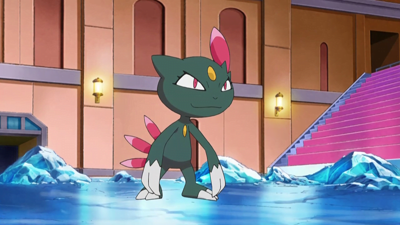
And this is its final form, which appeared for the first time in Crystal. A long way from the weasel that was on the list in 1997, and a more interesting design overall than the “animal with some interesting features”. The eyes are switched again, so it’s now looking down instead of up, the white sports become jewels, and the colours are switched around – dark blue skin, pink feathers. What didn’t change, interestingly, was its Shiny form, which stayed pink all along.
Of course, prior to Gen III, most Pokémon hadn’t been set in stone, and their designs changed somewhat between games. We know most of those changes: the very ugly Red and Green sprites being prettied up for Blue and the international versions, some glaring mistakes being fixed (like upside-down Koffing in Blue), the minor changes for the international Gold and Silver and Pikachu’s weight loss over the years. But Sneasel’s colour change is, probably, the biggest redesign of an already existing Pokémon ever recorded.
All in all, a pretty fascinating story. Sneasel was, at its core, a good story: a yokai that could fit as a Pokémon. Everything else was up in the air, from day 1 to a whole year after the games had come out. We don’t know if Sneasel is simply the most redesigned Pokémon in history – the old beta sprites we have glimpsed from the Gen I originals indicate that they didn’t undergo that many changes over its long development, and leaks of beta modern Pokémon designs are much more infrequent. Still, eight different designs make Sneasel the most documented sprite, from massive identity revamps to very minor changes: all of them were saved for eternity. And it’s a great example of how the idea of what a Pokémon was supposed to look like changed over the Gen II development cycle: from a cartoonish real animal to a completely unique creation.
Edited by Aldo, bobandbill, Jake, Kitty, Rabi, Siddhar, and Zach.