Sword and Shield graphics review: Sometimes nice, yet clearly rushed
It’s not all bad with Pokémon Sword and Shield, with some nice areas and aspects – but ultimately, graphics is not a strong point of Galar.
There is much to be said about the graphics and animations of Pokémon Sword and Shield. As part of our review articles of the games, we’ll touch on the good and the bad – there are some gorgeous aspects to like, but a lot more that does bear repeating. Graphics don’t generally affect the gameplay, and may not affect your enjoyment of the series, we do see room for improvement, and evidence the effort here was rushed.
We note that the parts of the game concerning battles are not covered here; you’ll want to look at our other review article for that.
[Updated] Battles visually lacking in Pokemon Sword and Shield
Towns: the highlight of locations
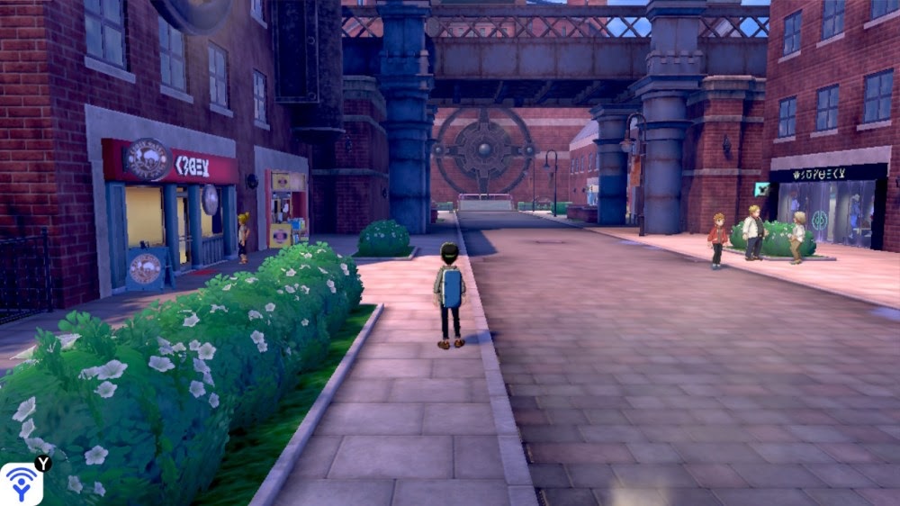
There are two main highlights graphics-wise of the Pokémon Sword and Shield games. If we’re considering locations – environments or areas – then towns and cities were that. Motostoke is a prime example of a city that really looked nice and interesting to explore, with its own identity. There was a clear design choice made with these areas, and they were mostly well executed visually. Hulbury is another example with its own distinct flavour. Stow-on-Side feels very different because of how it looks, while Ballonlea is one of the most distinct looking towns in the Pokémon franchise, with fancy glowing lights and an otherworldly feel to it.
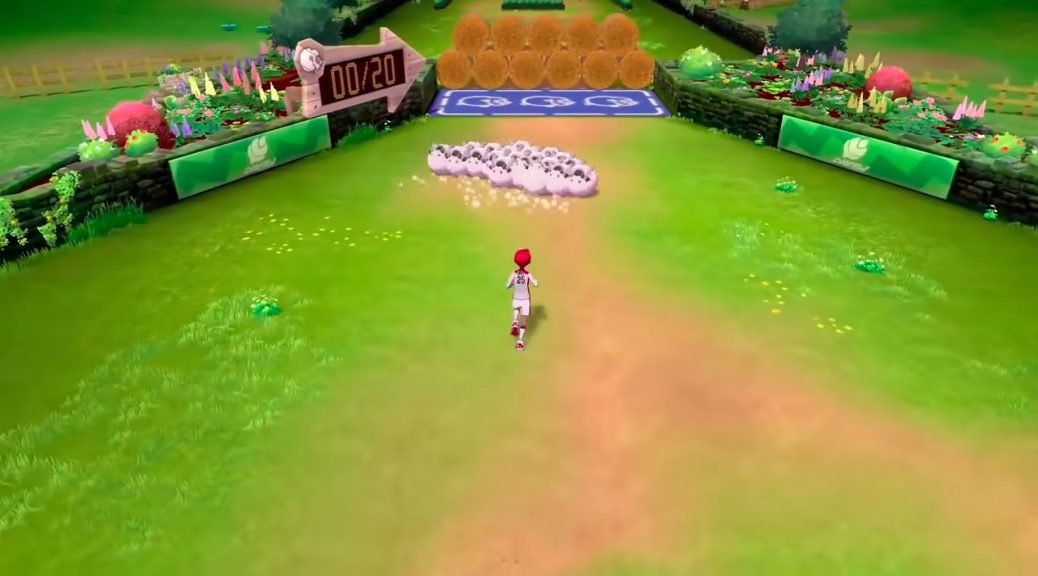
They’re not the only nice looking areas, of course. Galar Mines (1 and 2) were also nice areas to see, as was the end of the Slumbering Weald. It’s a shame the Routes were so darn linear, but this falls more in a game design fault, rather than a graphical one. One graphical flaw that can be pointed out for towns though is a lack of closed polygon loops on some map geometry. While not seen usually, in some cutscenes you can notice flickering seams here and there, showing a lack of properly polished modelling on buildings or pieces of furniture.
One nice touch is that the world of Galar is quite connected. There’s good effort in having the areas appear at different times. One example is the bridge you go underneath in the Wild Area. You can also travel over it and see the same Wild Area from above, as well as see Hammerlocke in the distance. Another case is seeing Professor Magnolia’s house in the distance of Route 2, giving you a clear destination to aim for. This lack of pop-in here is well done.
However, speaking of pop-in…
Pop-in a clear issue
For character models, pop-in (and pop-out) is bad, plain and simple. There is some level of understanding for this to happen in the Wild Area, with numerous Pokémon to track. Nonetheless, it detracts from the experience, and is even more painful when you go online and see other character models come in and out willy-nilly.
But the line has to be drawn when in even offline-only areas, such as Routes and towns, you encounter this issue. You can see NPCs disappear and reappear in front of you from a short distance, in places where there should be a firm handle on how many models need tracking, and it just… looks bad.
It even affects more important story moments, like when you reach the top of Rose Tower. (The forced teleportation is also a bit odd here.)
I wanted to explore… but Oleana demands attention pic.twitter.com/hCj8gzQkAp
— bobandbill (@bobplusbill) January 26, 2020
People – sometimes good, sometimes stiff
The people of the games… have a varied reception for me in how they looked. There’s stuff to like, certainly. Gym Leaders all have distinct designs and themes behind them. All the ball throwing animations for the Trainer types look good. And while the Policeman and Artist Trainer types are creepy in a sense, they have a distinct style to them that should be applauded.
All Regular Character Throwing Pokeball from Sword and Shield.
The animation are well done.👏👏 pic.twitter.com/Lm5iyvgzG5
— Mixeli (@PokeliYT) January 23, 2020
That said, when you see them walk through towns, or stand with arms outward from them in an unnatural stiff manner, they don’t quite look right. And some other animation choices are weird too. We know they animated clapping, because Chairman Rose applauds you at the end of your battle. Yet come to the scene in the post-game story where you are being clapped, you see the supporting NPCs not do that. Then there are lazy shortcuts, such as not bothering to animate Yamper disable the lock on an elevator (the game cuts away instead), or the much complained about scene involving the Legendary cover legends walking and turning around on the spot. Again – rushed.
There are other inconsistencies too. We’ve seen the long handshakes you have with Gym Leaders throughout the game. Apparently though you refuse to shake the hand of a young fan…
Sorry kid, I don't do real handshakes with just anyone. pic.twitter.com/PhuhT9srwb
— bobandbill (@bobplusbill) January 26, 2020
Forced Camera
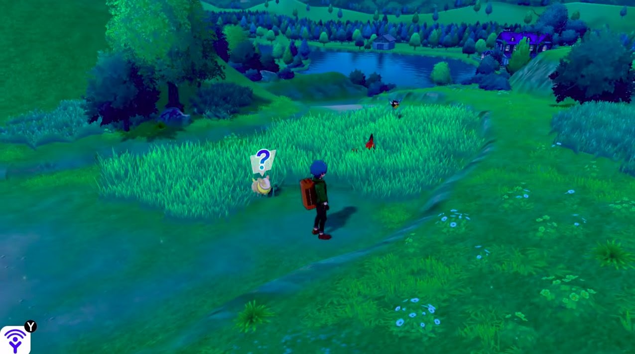
The Wild Area allows you to pan the camera around as you please, and thank goodness for that. It’s worth pointing out that this is not the case anywhere else though, which hampers the experience. In the really nicer areas of the game, you can’t just look at what you’d like – you are forced to look at what Game Freak wants you to see.
This has some advantages. The panning to show the towns in the background, or the large image of the figure on a hillside, are nice moments to consider. But there’s no chance to discover more yourself outside of what the developers intended. One hopes that in future games we’ll have more control in what we can see ourselves.
Weather implementation lacking
Weather effects outside of battles could use a bit of polish, both in implementation, and how they look. There are three main complaints to make on what is otherwise a neat aspect of the games.
One: the transitions are lacking. You can make a mere step and the weather will jump from one extreme to the next. This serves to make the Wild Area segmented, rather than a truly continuous large area.
Two: the effect of several weather conditions (sandstorm, fog, etc) are too strong. It gets in the way of gameplay – that is, ability to see Pokémon and the Max Raid beams of light. Given these beams of light are normally quite bright, being unable to see them from a reasonable distance fairly often strikes me as an oversight.
Three: weather is only ever seen in the Wild Area. This again makes other Routes or towns feel lesser as a result, less like an actual area and more something in-between.
Camp – so that’s where the animations went
In a few words: Pokémon Camp is great. It is the other visual strength of the game. Camp looks very polished, is full of various animations that give our favourite Pokémon personality, and has fun interactions between each. You can coax your partners to attacking a Poké Toy, or have them play fetch with a ball. They even have races with each other! There’s a lot to like, and this is one of the less rushed areas of the game.
One of my favourite new animations is Appletun's one. Its top leaves clap, the helmet does a flip, you see it has eyes there… pic.twitter.com/7lB0dGugHC
— bobandbill (@bobplusbill) January 26, 2020
There is room for nitpicking this otherwise visual highlight of the game, however. The animation for picking up the balls is lazy for most Pokémon, for instance. More concerning is that in functionality, Camp has gone backwards. Sure, you couldn’t have your Pokémon play fetch – but you did have animations for them to be petted, brushed, fed by hand, and so forth. All those aspects from Amie and Refresh are now gone. Then there’s a few glitches with animations, such as a failure to properly track the ball.
Well, at least he tried. pic.twitter.com/d5RUsGnvAA
— bobandbill (@bobplusbill) January 26, 2020
The one replacement for feeding is via Pokémon Curry, and that is a bit disappointing to see, personally. Your Pokémon appear to be eating air, and it looks silly without being particularly funny looking – it just looks odd and out of place.
Eating air because Appletun is watching pic.twitter.com/a4Yi8GM9DP
— bobandbill (@bobplusbill) January 26, 2020
Otherwise, it’s great and a highlight for showcasing the Pokémon themselves. Let us hope we see more of their personality outside of sidegame content such as Camp in future games.
Togepi has a pretty cute twirl and waddle. pic.twitter.com/1PnaMoRfGm
— bobandbill (@bobplusbill) January 26, 2020
The Copperajah in the room
Of course, it won’t be a review of the graphics without highlighting the main deficiency of the Galar region, and that falls to the Wild Area. There has been an awful lot said about the low-resolution textures for the trees, the issues with water (lack of ripples, no transition between shoreline and the middle), the pop-in of fellow Trainers and Pokémon, and even visual glitches, like a Woobat sinking into the ground in trying to reach you, or a Gyarados clipping through you, then turning on the spot to leave.
Woobat are you okay
Get out of there Woobat pic.twitter.com/soHL2Xz1gK
— bobandbill (@bobplusbill) January 26, 2020
To get to the point – it’s bad, and a lot of work could have been done to improve this to reach the level seen in towns (in some aspects, anyhow).
Hi Gyarados
Bye Gyarados pic.twitter.com/gA7UstTqXx
— bobandbill (@bobplusbill) January 26, 2020
Overall, it’s a mixed bag all over the shop. There’s clear evidence of good things done visually, but some lack of foresight in implementation, and clear corners cut in others, show that the game was rushed. The battle animations review article gives further, more detailed evidence of this. Sadly, that meant that graphics suffered in places. Here’s hoping we see better planning in later titles – and the DLC parts of Pokémon Sword and Shield – that make the games easier on the eye.
Edited by Aldo, Mercury, and Sheep.