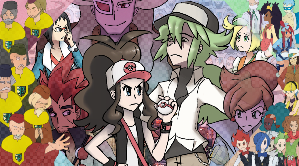
Part I: The Components of Unova
For the anniversary of the release of Pokémon Black and White, we release our tribute to the games. Part I focuses on gameplay and other mechanics, as well as their themes.
Part I: The Components of Unova
Hexagons | Adventure | Dreams | Seasons
Discovery | Myths | Sprites | Music | Accessibility
The Appearance of Unova: The Perfect Unity of Sprites
The more realistic something seems, the less one can suspend their disbelief with it. As Pokémon games improve their graphics, more detailed 3D models and realistic backgrounds visually clash with any less polished areas. Background elements may feel out of place when compared to the anime-inspired looks of the characters. Actions are stated to be occurring but the screen cuts away or fades to black each and every time to avoid animating these actions. These examples, among many more, weaken the execution of modern Pokémon titles and do not properly make use of what 3D graphics are capable of producing. Not to mention the weakened character execution that comes from ineffective use of 3D, such as all of Alola’s residents speaking with one hand on their hip and waving the other around vaguely, the inappropriate blank stares of the protagonist while every other character expresses themselves through changes in facial textures, or Hau and Hop’s cross-generational connection via hopping around excitedly whenever literally anything happens.
Sprites, on the other hand, can “get away” with more precisely because they show less. Buildings in newer games need to be of proper scale and number to make a city really feel like a city—a necessity now that the series is pushing towards more realistic proportions in its characters. But every single building can’t be accessible, resulting in locations that look huge but feel incredibly small thanks to the number of places that can actually be entered. An older city like Gold, Silver, and Crystal’s Goldenrod can get away with oddly-shaped houses with no space between them and most having no doors because the game already looks very unrealistic to begin with—players’ suspension of disbelief is kept consistent, and as such they don’t see anything wrong with this scenario. It’s the same reason why classic 2D animated films can utilize drastic color palettes and singing animals while 3D remakes focused on being “hyper-realistic” can’t without feeling as though something is inherently wrong.
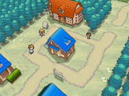 Black and White exist in that perfect balance—understandable, as the fifth generation was the final one to utilize sprites—where its sprites allow it to take shortcuts, but the sprites are detailed and polished enough that the locations still feel distinct, full, and almost as if they could truly exist in reality despite their fantasticalness. This allows places such as Nuvema Town to have a measly total of only four buildings without seeming awkward, and for Castelia City to still feel massive despite the player not being able to enter every single building or visit every individual floor of the ones they can enter. People rushing past is a shorthand for busyness and crowdedness—a shorthand players understand and that enhances the worldbuilding under the confines of a 2D game on the Nintendo DS hardware.
This sprite work also allows characters to feel dynamic without fully animating them. Although, it must be noted, that each main character does have a special animation all their own, including an impatient foot-tapping for Cheren and Bianca pulling her hat down to cover her face in disappointment. Wind blows through Alder’s hair, Ghetsis raises his left arm, and N boasts a head shake, raising of both arms, and raising one arm to call for his dragon. All this is already a beautiful additional effort and detail in the gorgeous sprite work of the games. But when it comes to player discussion, it’s all down to imagination.
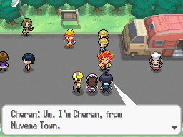 There are no facial expressions or animations, generic or otherwise, for characters to use when conversing with each other. For instance, Cheren’s first interaction with Alder can be interpreted different ways: after Alder assures Cheren that he is the Champion and is definitely not “goofing off,” Cheren replies with a simple “Um. I’m Cheren, from Nuvema Town.” Is that a sassy “um?” Or is Cheren perhaps trying to be more considerate—less “judgmental,” as Alder just described him—and choose his words more wisely, padding out his thoughts with filler? Each and every bit of dialog in Black and White can be interpreted freely by the player’s imagination, and this gives players both a talking point as well as additional investment in the story. Starting with the latter, players become more invested because they are forced to imagine the “little details” of these scenarios. For the former, these differences that will naturally occur—as each person is different and will therefore have a different mental image—allow fans to discuss their variety of interpretations. If everyone saw the same thing, there will only be so much to talk about—but allowing this kind of interpretation, on top of the leagues of literary interpretation already provided by the narrative at large, makes Black and White truly dynamic. Consider how even when a novel describes the physical appearance of a character, each reader has a slightly different mental image of what they look like, and relish in sharing fan art of their interpretations with each other.
One of the most commonly discussed elements of the sprites in Black and White, however, are simply how they look. Black and White were the first games in the main series to utilize full Pokémon back sprites, and were also the first games to utilize a “dynamic” camera during battle. Just as the camera in the overworld takes dynamic angles in certain spots, giving players swooping views of major landmarks, the camera during battle pans and zooms as Pokémon unleash their attacks. This is really the most dynamic a camera can be on a 2D plane with 2D sprites—the effort needed to include this is astounding and really brings battles to life, in addition to the sprites of the Pokémon themselves being full of character. But a big focus was placed on how “bad” the sprites looked when zoomed in or out. Sometimes characters have odd stretching resulting in humorous or simply unappealing in-betweens. But it’s really a small price to pay—not to mention in-betweens usually look rather odd anyway, even in the most professional of animated movies. The Pokémon series visuals had been improving naturally from generation to generation, but the camera angles were not. Battles were bland and scenes were stale. That is, until Black and White breathed new life into the camera just as it breathed new life into the Pokémon sprites.


And the long-term result is that Black and White are extremely future-proof. Booting up a DS cartridge on a Nintendo 3DS automatically stretches the screens to fit the 3DS’s aspect ratio, and it’s no exaggeration to say that it is shocking and flat-out ugly. But that’s not the case for Pokémon Black and White. It’s easy to not even realize you’re playing with the screen sized up because it looks just as good as it does on the Nintendo DS. Because the sprites are designed to be sized up and down for use with the overworld camera or battle camera, the entire game can be resized as needed on future consoles, something other DS games unfortunately have to contend with.
Black and White truly pushed sprites to their limit, resulting in a gorgeous game that holds up even ten years later. The dynamic camera is exactly what the series needed to feel visually exciting. And as if that wasn’t enough, even the storytelling benefits from its 2D execution, offering additional room for analysis and interpretation. Pokémon sprite work culminated at this point, one final love letter to the visual style that had serviced the series so well up until the change to 3D on the Nintendo 3DS.